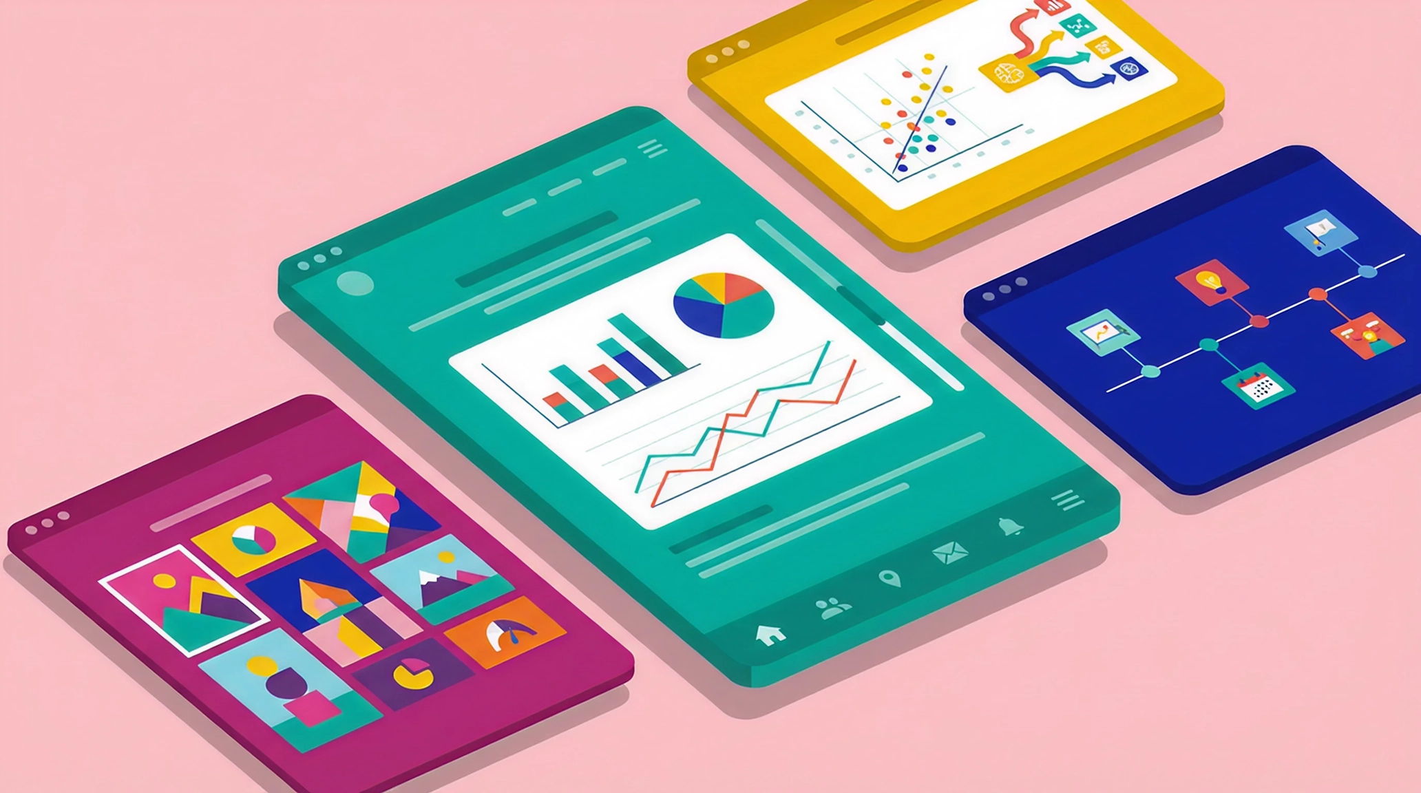
Looking for interactive infographic inspiration? We've gathered 12 examples — from data dashboards to scroll-driven product stories to corporate overviews — that show what's possible when you build infographics as web content instead of static images.
Static infographics are still one of the most effective ways to make data visual and shareable. But building an infographic as a web experience opens up a different set of possibilities: interactivity, search visibility, responsive design, and real-time analytics. No-code design platforms have made these formats more accessible than ever, so interactive infographics are now widely used across industries — from annual reports to product pages to awareness campaigns.
Each example below includes a breakdown of what makes it effective — so you can apply the same principles to your own work.
What is an interactive infographic?
An infographic is any visual that turns data, processes, or concepts into something you can understand at a glance. A static infographic does this as a designed image like a PNG, a PDF page, or a slide. An interactive infographic does it as a web experience: one that responds to user input through hover states, clickable elements, tabs, or scroll-triggered animations. Some use scrollytelling techniques to guide readers through a narrative.
You'll sometimes hear these called animated infographics. While animation is often part of the experience, the defining feature is that the reader controls it, not just watches. Unlike a static image file, a web-based infographic is indexable by search engines, responsive across devices, trackable through analytics, and embeddable on other websites — turning the same content into something that works harder over time.
What makes a great interactive infographic?
Three qualities separate examples that work from ones that feel like tech demos:
Every interaction should have a function. If removing the interactivity wouldn't change the reader's understanding, it probably doesn't need to be there. The best interactive infographics use interaction as a tool for data storytelling, not decoration.
Simplify, don't add layers. A well-designed interactive infographic takes a topic that would be overwhelming as a wall of text and makes it navigable. Pop-ups that break down a stat, tabs that separate themes, scroll-triggered reveals that pace the information — these serve the reader, not the designer's portfolio.
Design that earns attention. Strong visual storytelling principles still apply: clear headings, intentional colour and scale, and a layout that directs the eye before the click. Platforms like Maglr make this kind of interactive design accessible without custom development.
Let's see how these principles play out in practice. The interactive infographic examples below are organised by approach: data and statistics, storytelling and awareness, and corporate overviews.
Data and statistics
These examples show how interactive elements turn dense data into something that invites exploration.
Europool — Sustainability Report: Facts & Figures
Europool Group, a European logistics pooling company, dedicated a single page of their sustainability report to visualising key facts and figures. The design is abstract but striking. Bold colors and clean shapes present environmental and operational data without overwhelming the reader.
What makes it work: The tab navigation is the key decision. Instead of stacking everything into one endless scroll, Europool lets readers choose what to explore. Each section stays concise, and the abstract visual style makes the numbers feel approachable rather than clinical.
Hamilton Lane — Why Invest in Private Markets
Hamilton Lane, a global private markets investment firm, built this infographic landing page as both an educational tool and a lead generation asset. The page presents key investment insights through clean data visualisations and soft scroll-triggered animations, doubling as a landing page that provides genuine value upfront.
What makes it work: They're showing less can really be more. The animations are subtle (lines draw, simple fade steps) but they give the page enough motion to feel alive without distracting. The single-scroll structure with clear section breaks guides you through a complex topic without requiring clicks.
Pet Wave — Dog Statistics
Petwave turned a comprehensive dataset about dog ownership, health, adoption, and environmental impact into a visually rich, interactive experience. The infographic covers everything from breed popularity to the carbon footprint of pet food, presented through animated charts, illustrated icons, and scroll-triggered reveals.
What makes it work: The sheer scope could easily become overwhelming, but the design breaks the data into clearly defined sections with distinct visual identities. Each topic gets its own colour palette and illustration style, so scrolling through feels like moving between chapters rather than drowning in data.
Lyst — Denim: A Data Deep Dive
Fashion search platform Lyst created this data-driven exploration of denim trends, combining key statistics with creative visual storytelling.
What makes it work: What stands out is a scrolling timeline where circles grow and shrink to represent shifting quantities over the years, an inventive alternative to traditional charts. This circle-based visualisation communicates scale intuitively. You feel the difference rather than reading it off an axis.
Storytelling and awareness
Infographics don't always start with spreadsheets. These examples use interactivity to tell stories, explain concepts, and make people care about a topic.
Renault — Everything About Electric Driving
Renault worked with Maglr to build this interactive infographic explaining electric driving through a narrative — following a road trip that introduces charging stops, range indicators, and EV features along the way. The car progresses down the road as you scroll, with information appearing through scroll-triggered animations that match the journey. It's a textbook scrollytelling approach applied to product education.
What makes it work: The scroll controls the pace of the narrative. As the car moves down the road, information appears exactly when it's relevant — not before. This scroll-linked animation approach keeps the reader oriented and prevents information overload, because you only see what the story needs you to see at that moment.
Importance of Bees — by Ink & Craft
This environmental awareness piece uses playful illustrations, moving elements, and mouse-reactive animations to communicate the role bees play in our ecosystem. The design is warm and approachable with its soft colours, and hand-drawn style, which makes the serious underlying message friendly without diminishing it.
What makes it work: The mouse-reactive elements are a fun surprise. As you move your cursor, bees sway with it, and the experience becomes reactive in a way static content can't match. It's a reminder that interactivity doesn't have to mean clicking through tabs. Sometimes the most engaging interactions are ambient.
Zangezur
This website presents key data and historical context about the Zangezur region through a smooth scrolling experience. The design creates an earthy, immersive feel, with key data points surfacing directly on the homepage. Clickable sections lead to deeper content pages.
What makes it work: The combination of sticky and parallax effects gives the page a sense of depth without overwhelming the reader. The design is modern and sleek in a way that it lets the content and imagery do the heavy lifting rather than relying on flashy UI elements. Key figures are visible on the homepage, so visitors get the core message before deciding to click deeper.
State of Parenthood — by Brains for Hello Bello
Creative agency Brains built this interactive research report for baby care brand Hello Bello, presenting original survey data about the challenges and realities of modern parenting. The piece blends data visualisation with real parent quotes ensuring the statistics are based on actual voices.
What makes it work: Bold typography and generous whitespace let each data point land before the next one appears. The layout alternates between full-width stat callouts and smaller text blocks, creating a rhythm that keeps you scrolling.
Corporate overviews and reports
Interactive infographics are a natural fit for organisations that need to communicate results or key figures without burying them in a traditional report. They work particularly well as visual entry points to longer publications like interactive annual reports and product landing pages.
Action — Annual Update 2021
Discount retailer Action used Maglr to create this interactive infographic as the opening page of their annual update. The layout is block-based and playful, presenting key figures, milestones, and highlights in a format that feels more like a magazine cover than a financial summary.
What makes it work: The block layout lets readers scan everything at a glance, then dive into what interests them. Key figures are large and prominent, with enough context to understand what they mean without clicking further. For companies that need a quick visual summary of their year, this one page offers a nice snapshot.
Vechtdal Wonen — Annual Report 2024 Overview
Dutch housing association Vechtdal Wonen created this single-page infographic as an entry point to their annual report. The design is illustrative and approachable. A quick visual snapshot of the year's key numbers, with "read more" pop-ups that reveal additional detail without cluttering the overview.
What makes it work: The pop-up approach keeps the main page clean and scannable while still providing depth for readers who want it. The illustrative style with its warm colours and playful icons makes what could have been a dry overview feel inviting.
Pawsey — Setonix Supercomputer
Pawsey Supercomputing Research Centre in Australia worked with Australian agency Purple to build this page showcasing their Setonix supercomputer, presenting technical specifications and key figures in a visual, scrollable format. It sits at the crossover between a product page and an infographic, with data visualisations guiding readers through the machine's capabilities.
What makes it work: Technical specifications are hard to make engaging. Pawsey solves this by leading with visual impact through large numbers, clean layouts, and plenty whitespace. The scrollable format paces the information so you process one capability at a time rather than scanning a boring spec sheet.
Voda
Voda's homepage opens with key metrics and uses buttons to lead visitors into nested pages with additional data points. The overall format is clean and mostly static, but one click-through leads to a standout page that follows a water drop through key information. It's a subtle narrative device that fits the non-promotional, environmental topic.
What makes it work: The clean, easy-on-the-eyes style matches the subject matter. There's no visual noise competing with the data. The water drop page is a smart use of a single interactive element within an otherwise straightforward layout, proving you don't need interactivity on every page to make an impact where it counts.
What these interactive infographic examples teach us
Interaction should serve the reader. The strongest examples, like Hamilton Lane's subtle animations, Vechtdal Wonen's pop-ups, Europool's tab navigation, all use interactivity to make content easier and more fun to consume. It's there to help your reader navigate and make sense of the contents. Don't use it for decoration only.
The format is more flexible than most people think. Interactive infographics can be data dashboards (Pet Wave), narrative experiences (Renault), corporate overviews (Action), or full website homepages (Zangezur). If you're only thinking about charts with tooltips, you're leaving possibilities on the table.
Story and data aren't opposites, they're partners. The State of Parenthood pairs statistics with real voices. Lyst turns shopping data into creative visual metaphors. Renault wraps product specs inside a road trip. The best infographics don't choose between being informative and being engaging.
You don't need a development team to build this. Several of the examples above were created with design platforms like Maglr without writing a single line of code. Interactive infographics have moved from being agency-only projects to something any marketing or communications team can produce themselves. The barrier isn't technical anymore.
Start building
Ready to create an interactive infographic that people actually want to explore? Browse more examples in our inspiration gallery or request a demo to see how Maglr can help you build interactive infographics, data visualisations, and visual stories.