You spent weeks on that report. Stakeholder interviews, data pulled from three departments, four rounds of revisions. It goes live. Average time on page: 54 seconds.
What went wrong wasn't the content. It was what the content looked like.
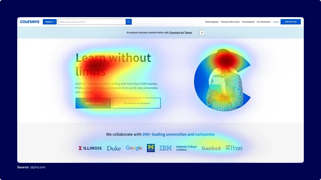
To improve engagement, you need to understand where most content actually fails: not in substance, but in presentation. Content engagement—time spent, scroll depth, actions taken—is decided in the first few seconds, before anyone reads a word.
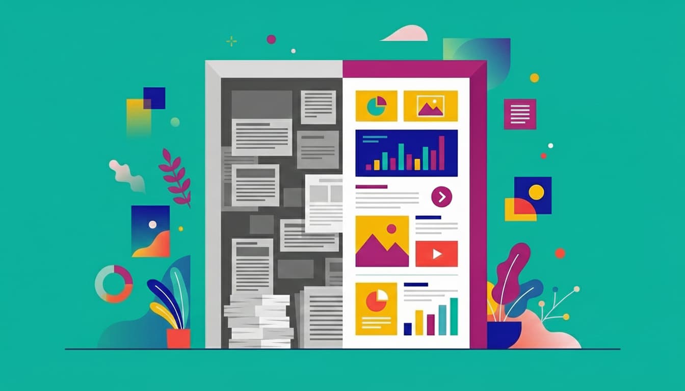
Corporate content fails because it looks like corporate content
Your audience decides whether to engage before they read a single word.
Dense layouts, text-heavy pages, templated designs—these signal effort, not value. And in that split-second judgment, 79% of readers default to scanning rather than reading. Most never make it past the first scroll.
Here's what makes this frustrating: the problem isn't attention spans. That claim about humans having shorter attention spans than goldfish? It's been debunked repeatedly. People happily spend 45 minutes on a podcast or binge a long-form article that hooks them. An analysis of 912 million articles found that content between 1,000-2,000 words generates 56% more social shares than shorter pieces.
Audiences can focus. They just choose not to when the format doesn't earn it.
What happens in those first few seconds isn't a failure of attention—it's filtering. Your audience is deciding whether your content deserves their focus. And that decision is based almost entirely on presentation, not substance.
A wall of text signals that you couldn't be bothered to make this easy for your reader.
Why less content gets more read
At Maglr, we see this pattern constantly: teams agonize over cutting content for fear of losing the complete story. Every section feels essential. Every data point earned its place. You've done the research, conducted the interviews, gathered the insights. Leaving anything out feels like a disservice to the work.
The irony? The complete story wasn't being read anyway.
When readers see an overwhelming page, they disengage. You've lost them before you made your point. All that careful, complete content? Ignored.
The counterintuitive truth: segmenting content and improving presentation gets more of your message across, not less. A reader who engages with 60% of a well-structured piece absorbs far more than one who bounces after 10 seconds of a dense one.
This isn't about dumbing down your content or stripping out substance. It's about earning attention first, then rewarding it. You can still tell the full story—you just need to present it in a way that invites readers in rather than overwhelming them at the door.
What readers see in the first three seconds
Your brain processes images in as little as 13 milliseconds—faster than you can consciously register them. That's why the first three seconds of content exposure aren't about reading. They're about visual judgment.
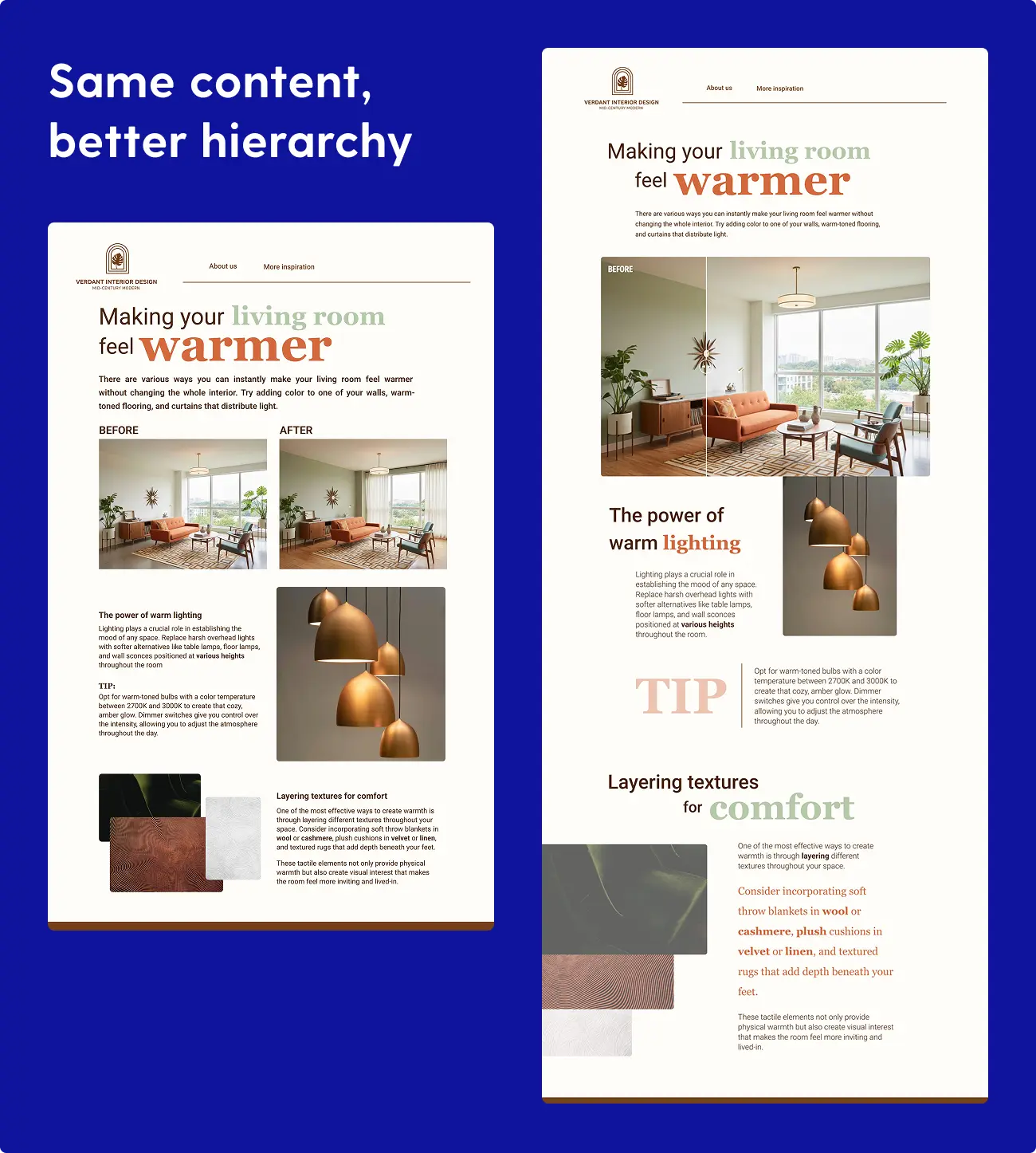
Before a single word is processed, your audience has already decided whether your content looks worth their time. That decision happens through visual signals: layout, contrast, hierarchy, whitespace. Dense text with no visual breaks tells readers to move on.
This is where visual storytelling becomes essential—not as decoration, but as communication through design. Contrast draws attention to what's important. White space prevents cognitive overload. Visual flow guides the eye from hook to payoff. These aren't aesthetic choices. They're functional ones that determine whether readers stay or leave.
Content that uses visual hierarchy—clear sections, breathing room, distinct visual anchors—earns the next scroll. Content that ignores these principles fails the filter test before anyone engages with the substance.
The difference between content that gets ignored and content that holds attention often comes down to this: does the visual presentation invite readers in, or does it overwhelm them before they start?
3 ways to improve content engagement
Three factors consistently make the difference between content that gets ignored and content that holds attention. These aren't design tricks or cosmetic fixes—they're fundamental shifts in how you present information.
1. Visual hierarchy that guides, not decorates
Your layout should answer one question instantly: "Is this worth my time?"
That means:
- Subheadings that preview value, not just label sections. "Why 70% of reports never get read past page one" tells readers what they'll learn. "Introduction" tells them nothing. Every subheading is a promise—make it specific enough that a reader could decide whether to read that section based on the heading alone.
- Visual breathing room. White space isn't wasted space—it signals you've done the work to make this digestible. Cramming more content into less space doesn't make your piece more valuable. It makes it look harder to read. Every element on the page should have room to stand on its own.
- One idea per section. If a reader scans and gets the gist, you've succeeded. They'll go deeper if they care. Trying to pack multiple concepts into a single section creates cognitive overload and encourages skimming past everything. Let each idea land before moving to the next.
- Visual breaks every 75-100 words. Eyes need rest. Unbroken text creates fatigue before your argument lands. This doesn't mean adding decorative images everywhere—it means using subheadings, pull quotes, bullet points, and spacing to create natural pauses. Think of it as rhythm: long passages need punctuation.
- Progressive disclosure of detail. Lead with the insight, follow with the evidence. Readers who want depth will keep reading. Readers who got what they needed can move on. Front-loading your key points respects both audiences.
Research shows that scannable, concise layouts improve usability by 124% compared to dense text. Not because readers are lazy—because good structure signals respect for their time. When readers see a well-organized page, they trust that the content inside has been equally well-considered.
The goal: readers should be able to scan your content and understand its structure within seconds. If they can't figure out what's in it for them at a glance, they'll leave before finding out.
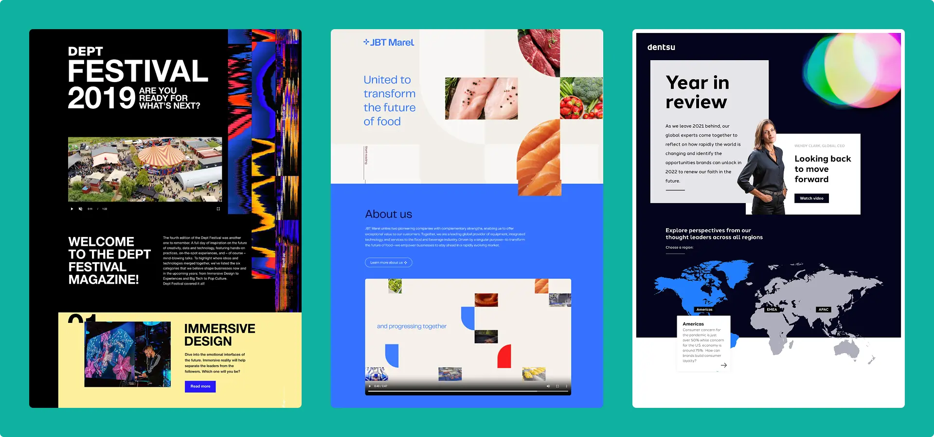
2. Interactive elements that invite exploration
Better content lets readers control the journey. Scroll-triggered reveals, expandable sections, interactive data visualizations—these transform passive reading into active exploration. The reader becomes a participant, choosing what to dive into and what to skim past.
The difference matters. Reading a static infographic versus exploring an interactive version where you can hover, click, and discover creates a completely different experience. One format presents information. The other invites you in.
A study by Demand Metric found that interactive content generates twice the conversions of static content because it invites participation rather than demanding endurance. When readers feel in control of their experience, they stay longer and absorb more.
But interactivity isn't about animation for its own sake. One purposeful reveal per section is enough. More than that and you're decorating, not guiding. Scroll-triggered effects that don't reveal new information are just distractions. Hover states that don't add context are visual noise.
The test: does this element help readers find what matters, or is it just making the page move? If you can remove an interactive element without losing clarity or impact, you probably should.
3. Format matched to intent
Different content types require different presentation approaches. Mismatches kill engagement even when the content itself is strong.
Annual reports and ESG communications serve readers who want to scan for specific information—financial performance, key metrics, strategic direction. These readers aren't starting at page one and reading to the end. They're hunting for what's relevant to them.
A multi-page structure with clear navigation works well here. Progressive disclosure lets readers access summary views or detailed data depending on their needs. Visual summaries at the top of each section help scanners find what they're looking for. The goal is to let readers build their own path through the content rather than forcing a linear journey. Learn how to design interactive annual reports
White papers and thought leadership serve readers evaluating solutions who need depth. These readers are willing to invest time—but they want to control how they invest it.
Long-scroll formats with anchor links let readers jump to relevant sections. Expandable technical sections serve both the skimmer who wants the overview and the specialist who wants details. A clear narrative thread should guide readers through your argument, but let them choose their depth at each point.
Campaign pages and product launches serve readers who need to understand one key message quickly. These readers are deciding whether to take action, not settling in for a long read.
Bold visuals, minimal text, a single clear call-to-action. The entire message should be visible immediately—don't make them scroll to understand what you're offering. Every element should support one goal: getting to yes. If something doesn't directly serve that goal, it's a distraction.
When format and intent align, content engagement follows. When they don't, even great content underperforms. You can have the best insights in your industry, but if you present a quick-decision campaign page like a deep-dive white paper, readers won't stick around to find out.
How Bidwells made their corporate content impossible to ignore
Bidwells, a UK property consultancy, produces research reports as a thought leadership strategy. The content was solid—original market insights, useful data, strong analysis. Exactly the kind of expertise that builds credibility and attracts clients.
But the format told a different story. The presentation didn't match the quality of the thinking inside. Strong insights were trapped in a format that signaled "generic corporate content" before readers engaged with the substance.
Switching to an interactive, visually-led format changed that. Key insights became scannable. The visual design invited readers in. They could explore the highlights quickly or go deeper into sections that mattered to them. The full report remained available via a sticky download button—gated for lead capture—for those who wanted the complete document.
The results:
- 4 minutes 40 seconds average session time—roughly 5x the industry average of 52-54 seconds
- 17% of visitors clicked to download the full report—a strong conversion rate for gated content
Same insights. Same research. Different format. Completely different engagement.
The content didn't change. The presentation did. And that made all the difference in whether audiences actually engaged with what Bidwells had to say.
Explore examples of high-engagement corporate content →
Content engagement is a presentation problem
Most advice about content engagement focuses on what happens after someone decides to engage—scroll depth, time on page, interaction rates. Those metrics matter. But they're useless if no one engages in the first place.
The real bottleneck happens in the first few seconds, when your audience decides whether your content is worth their time. That decision is based almost entirely on format signals, not content quality. By the time they're evaluating your argument, you've already won. The challenge is getting them to start.
Your competitors are stuck producing content that looks like corporate content: dense, templated, overwhelming. These formats fail the filter test instantly—and readers are gone before you've made your point.
Differentiation starts with presentation:
- Signal structure immediately with clear visual hierarchy that tells readers this content respects their time
- Use visual storytelling to communicate before readers even start reading—visuals are processed faster than text
- Invite exploration rather than dumping all information at once
- Match format to intent so readers get the experience they expect
Stop optimizing for completeness. Start optimizing for the first three seconds.
Your reader decides whether to engage before they read a word. Make sure your format earns that attention—because no matter how good your content is, it can't make an impact if no one sticks around to read it.