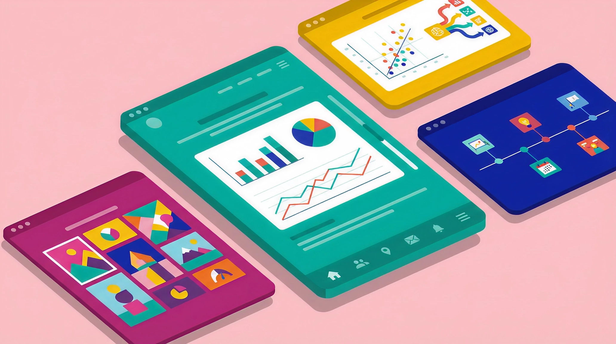
Looking for scrollytelling inspiration? We've gathered 10 examples — from corporate annual reports to data journalism to science education—that show what's possible when content and design work together.
Scrollytelling uses scroll-triggered animations, visuals, and text reveals to guide readers through a narrative — turning passive reading into an interactive experience. If you're new to the format, start with our guide to what it is and how it works.
Each example below is followed by a quick breakdown of what makes it effective, so you can steal ideas for your own projects.
Scrollytelling in journalism and media
The best newsrooms have embraced scrollytelling as a way to tell complex stories that hold attention. These three examples show how scroll-based narratives can turn dense topics into compelling experiences.
1. SCMP - Ozzy Osbourne: A Visual Journey
The South China Morning Post's tribute to the Prince of Darkness is a masterclass in biographical storytelling. The piece moves chronologically through Osbourne's life — from Birmingham to Black Sabbath to solo stardom — using scroll-triggered illustrations, archival imagery, and carefully paced text.
What makes it work: The pacing. SCMP doesn't rush through decades of history. Instead, they let each era breathe, using visual transitions to signal shifts in time. The horizontal scroll sections add variety without feeling gimmicky.
2. The Pudding - In Pursuit of Democracy
The Pudding analyzed every mention of the word "democracy" in Congressional records since 1880 — and turned 145 years of political speeches into a scrolling data narrative. Each dot represents five speeches, with highlighted dots showing moments when lawmakers warned that democracy was under threat.
What makes it work: This is data storytelling at its best. The data doesn't just support the narrative — it is the narrative. You scroll through the big picture (patterns across decades) while individual speeches surface to ground the statistics in real words from real people. The result is both analytical and emotional.
3. PolskaPress - Oblicza Zbrodni
True crime longform is at peak popularity and this piece from Polish media group PolskaPress (created with Maglr) shows why the genre and scrollytelling are a natural fit. The story explores grim historical events through atmospheric photography, layered visuals, and a dark color palette that feels closer to documentary filmmaking than traditional publishing.
What makes it work: The design doesn't just present the story — it amplifies it. Dark tones and deliberate pacing create tension before you've read a single word. Scrolling feels weighty, almost reluctant, which mirrors the gravity of the subject matter. That emotional friction makes the content land harder.
Corporate and B2B scrollytelling examples
Annual reports have long been trapped in static PDFs — a format that's increasingly ineffective for digital audiences. These four examples show how leading brands are rethinking the format entirely.
4. BMW Group - Report 2024
BMW's 2024 report opens with a cinematic video introduction, then unfolds into scroll-triggered stories about production, sustainability, and innovation. An interactive global map lets you explore BMW's operations by region, and video statements from leadership add a human element. The piece won a Red Dot Award — proof that an annual report can be a statement piece, not just a compliance document.
What makes it work: BMW separates "stories" (narrative content) from "management report" (detailed financials), so casual readers and analysts both find what they need. The scroll animations are polished without being distracting. For more on this approach, see our tips for bringing annual reports to life.
5. Adidas - Annual Report 2024
Adidas takes a different approach — bold typography, animated statistics, and a quiz that tests your knowledge of the brand. The CEO interview is woven into the experience rather than buried in a PDF, and ESG metrics are presented with the same visual care as revenue figures.
What makes it work: This doesn't feel like a compliance document. The design reflects the brand's energy, and interactive elements (like the quiz) make dry topics more approachable.
6. Bidwells -Driving Innovation at Speed
Property consultancy Bidwells used Maglr to create this research report on the UK's motorsport innovation cluster. The piece combines scroll-triggered data visualizations with industry analysis, positioning Bidwells as a thought leader in a niche sector.
What makes it work: Bidwells presents an engaging preview of the research through scrollytelling, then gates the full report behind a form. It's lead generation that doesn't feel like a transaction — readers get genuine value upfront, and those who want more are happy to exchange their details. We explored this strategy further in our piece on fixing corporate content engagement.
7. Netmotion Software - The Future of Work
Netmotion surveyed 400 IT and security leaders about hybrid work — then distilled the findings into a single scrollytelling page. Rather than burying insights in a 30-page PDF, the format forces clarity: every stat earns its place, and scroll-triggered charts make the data stick.
What makes it work: Thought leadership often fails because it tries to say everything. This piece succeeds by being ruthlessly focused. One topic, one page, and a clear takeaway — that's what makes readers actually finish it.
Educational scrollytelling examples
Scrollytelling shines when you need to explain something complex. These three examples use scroll mechanics to make abstract concepts tangible.
8. If the Moon Were Only 1 Pixel
Designer Josh Worth created this "tediously accurate" scale model of the solar system, where the moon is exactly one pixel wide. You scroll horizontally through the vastness of space — and the emptiness is the point. Witty commentary appears in the void between planets, making the experience both educational and oddly meditative.
What makes it work: By committing fully to accurate scale, Worth makes you feel how big the solar system is, not just understand it intellectually. It won the 2014 Webby Award for science websites and has been used as a teaching tool worldwide.
9. ONVZ - Het Grote Breindossier (The Great Brain Dossier)
Dutch health insurer ONVZ created this interactive brain health guide. An illustrated brain diagram lets readers hover over different regions to learn their functions, while scroll-triggered sections cover sleep, nutrition, stress, and exercise.
What makes it work: The interactive brain diagram turns readers into explorers. Instead of reading a list of facts about brain regions, you hover over the illustration and choose what to learn. That sense of control keeps attention longer — and makes medical content feel approachable rather than clinical.
10. Raging Wildfire Rising
This showcase piece, created by Maglr's design team, demonstrates how scrollytelling can make complex topics feel inviting rather than overwhelming. The piece covers wildfire science — causes, spread patterns, firefighting techniques, climate feedback loops — using video backgrounds, animated infographics, and layered information reveals.
What makes it work: Wildfires are a heavy subject, and a traditional article might struggle to hold attention through the science. Here, the format does the heavy lifting. Visual pacing breaks dense information into moments of discovery, turning what could feel like a lecture into something closer to a documentary. You learn without realizing you're learning.
What these examples teach us
Scrollytelling has gone mainstream — health insurers, property consultants, B2B software companies are all using scroll-based narratives to stand out. If your competitors are still publishing static PDFs, that's an opportunity. Immersive content is winning the war for attention.
Restraint beats spectacle — not every section needs animation. The BMW report uses subtle transitions; The Pudding lets data carry the weight. When scroll effects distract from the story, they're working against you.
Tone should match subject — PolskaPress uses darkness and deliberate pacing for true crime, Adidas brings energy and playfulness, and the solar system piece embraces emptiness. The format amplifies what the content is trying to say; it shouldn't fight against it.
Businesses have stories too — Some of the provided examples aren't media companies, yet their scrollytelling rivals anything from traditional publishers. There's no excuse for boring corporate content. If you're investing in the format, know what action you want readers to take at the end.
Start building
Ready to create scrollytelling content for your brand? Browse examples in our inspiration gallery or request a demo to see what's possible.