Looking for impact report inspiration? We've gathered 9 examples — from global health partnerships to B Corp agencies to impact investment funds — that show what's possible when mission meets design.
Impact reports are how organizations prove their work matters. But too many read like compliance documents: dense, forgettable, filed away. The examples below take a different approach. They turn data into stories, metrics into moments, and readers into believers.
Each example includes a breakdown of what makes it effective — so you can apply the same principles to your own reporting.
What is an impact report?
An impact report communicates an organization's social, environmental, or community outcomes over a defined period. Unlike traditional annual reports focused on financials, impact reports center on mission-driven results: the change your work created in the world.
The best ones go beyond metrics. They combine data with storytelling to make outcomes tangible and memorable. Whether you call it an impact report, sustainability report, or social impact report — the goal is the same: prove that your work matters.
What makes a great impact report?
Three things separate forgettable reports from ones people actually read:
Clarity of purpose. Great impact reports know their audience. Are you reporting to donors, investors, partners, or the public? The framing, depth, and tone should match.
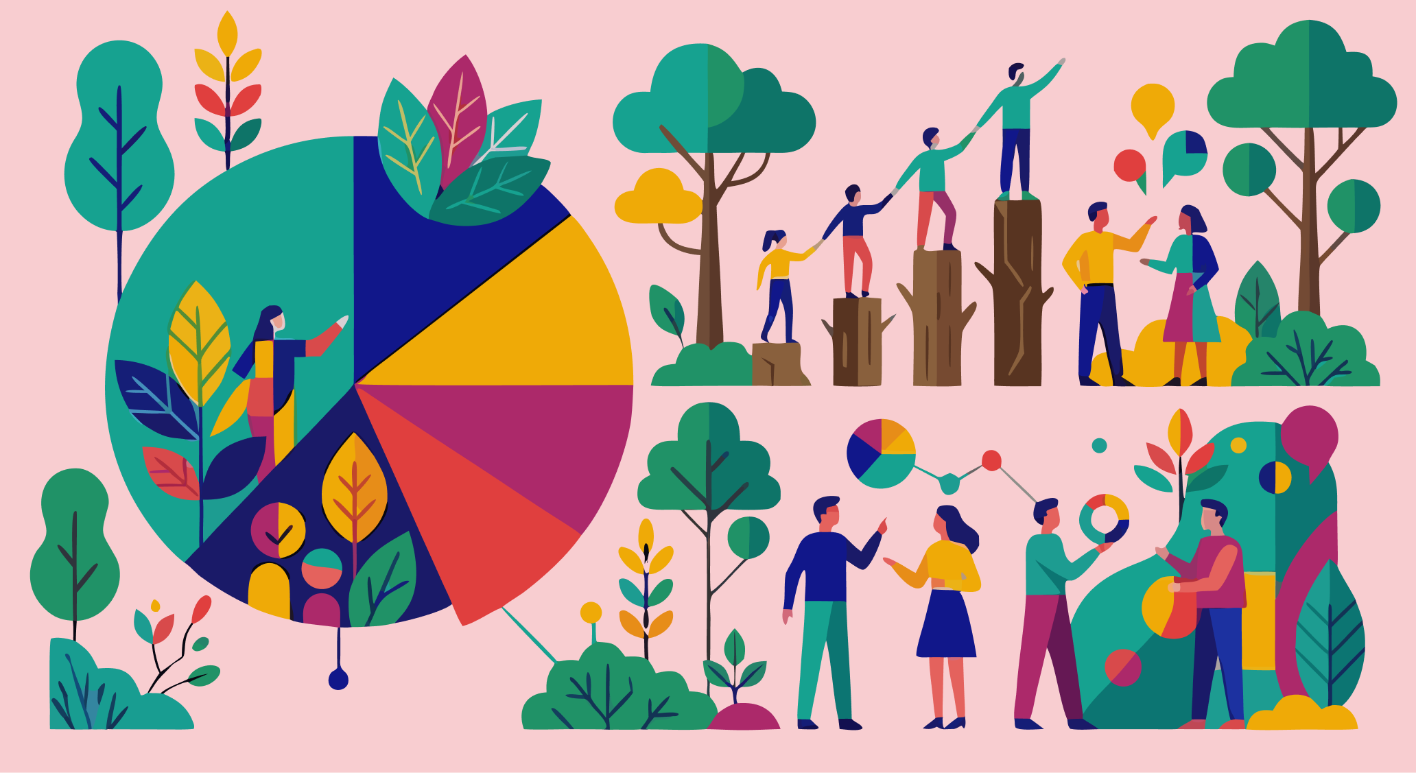
Story alongside stats. Numbers alone don't move people. The best reports pair metrics with human stories — like a farmer whose income doubled over three years, or a community that rebuilt after disaster. This is visual storytelling in action.
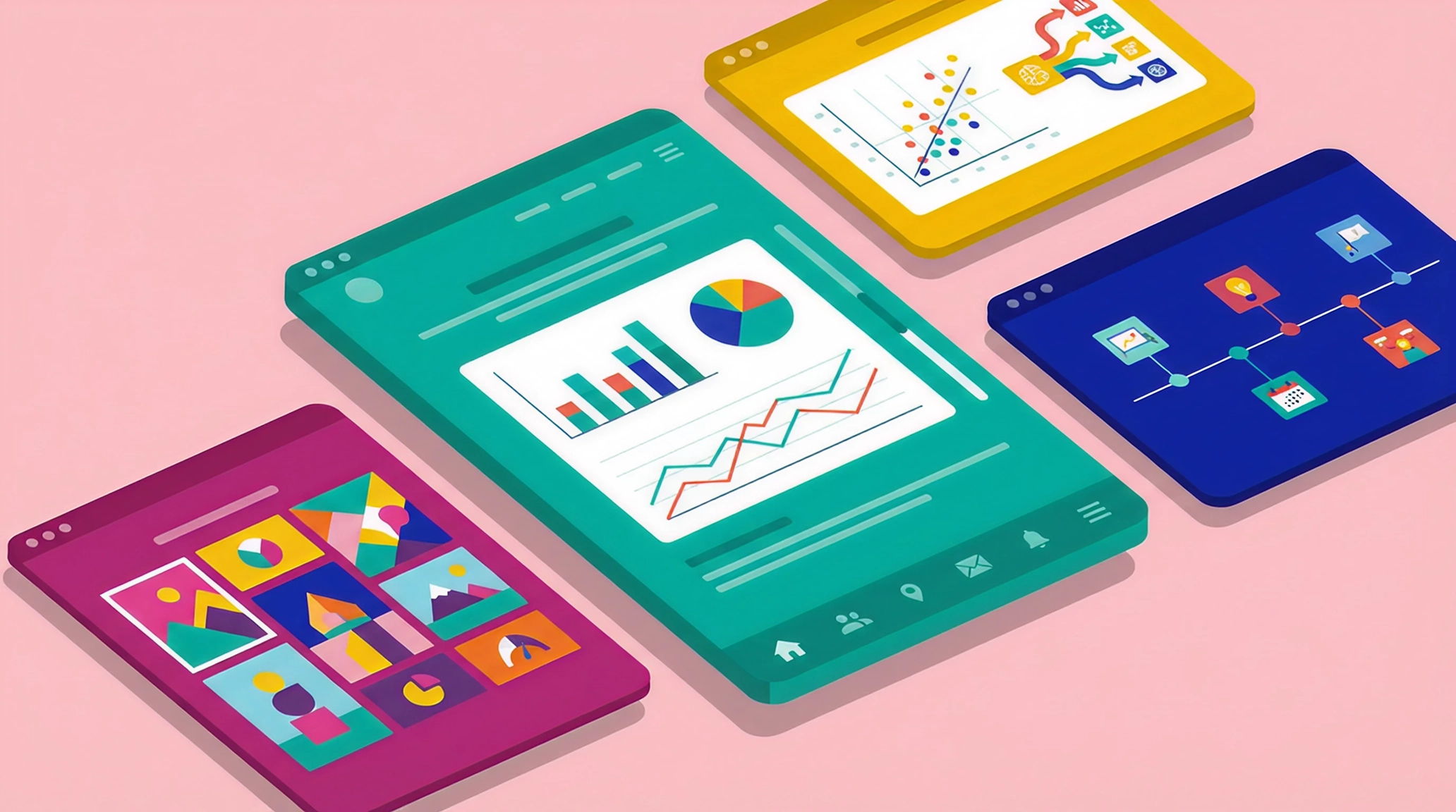
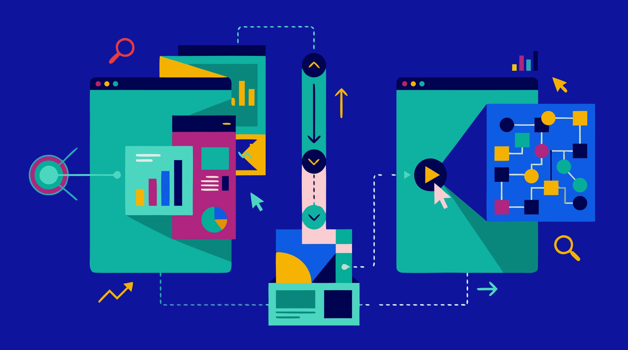
Design that earns attention. Static PDFs get skimmed and forgotten. Interactive reports that use scroll-based design, video, and data visualization hold attention longer and leave a stronger impression. Platforms like Maglr make this kind of interactive reporting accessible without custom development.
Let's see how these principles play out in practice. The examples below are organized by approach: community-centered, narrative-first, and data-driven.
Community-centered impact reports
The best impact reports don't just talk about communities — they put community voices and outcomes at the heart of the story. These three examples prioritize people, partnerships, and local work over institutional achievements.
1. Plant with Purpose — 2024 Triennial Impact Report
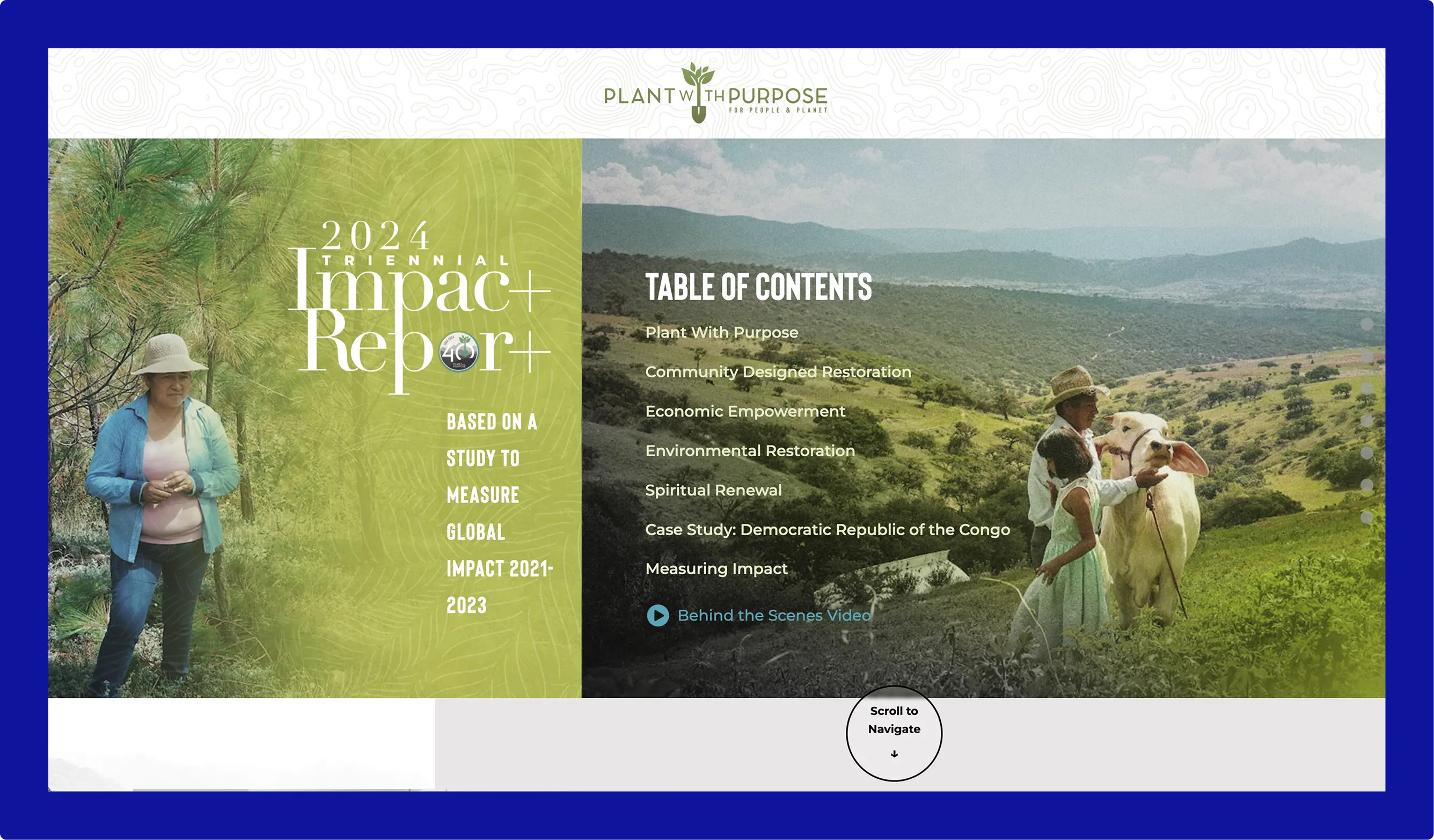
Plant with Purpose has spent 40 years working at the intersection of poverty and environmental degradation. Their triennial impact report covers reforestation, savings groups, and regenerative farming across multiple countries — including a deep-dive case study on the Democratic Republic of Congo.
What makes it work: The interactive watershed diagram. Hovering reveals how different interventions connect — soil health, crop yields, savings — making a complex theory of change feel explorable rather than overwhelming. Photography throughout puts faces to the statistics, so when the 55% poverty reduction figure appears, you've already met the farmers behind it.
2. Rabo Foundation — Impact Report 2024
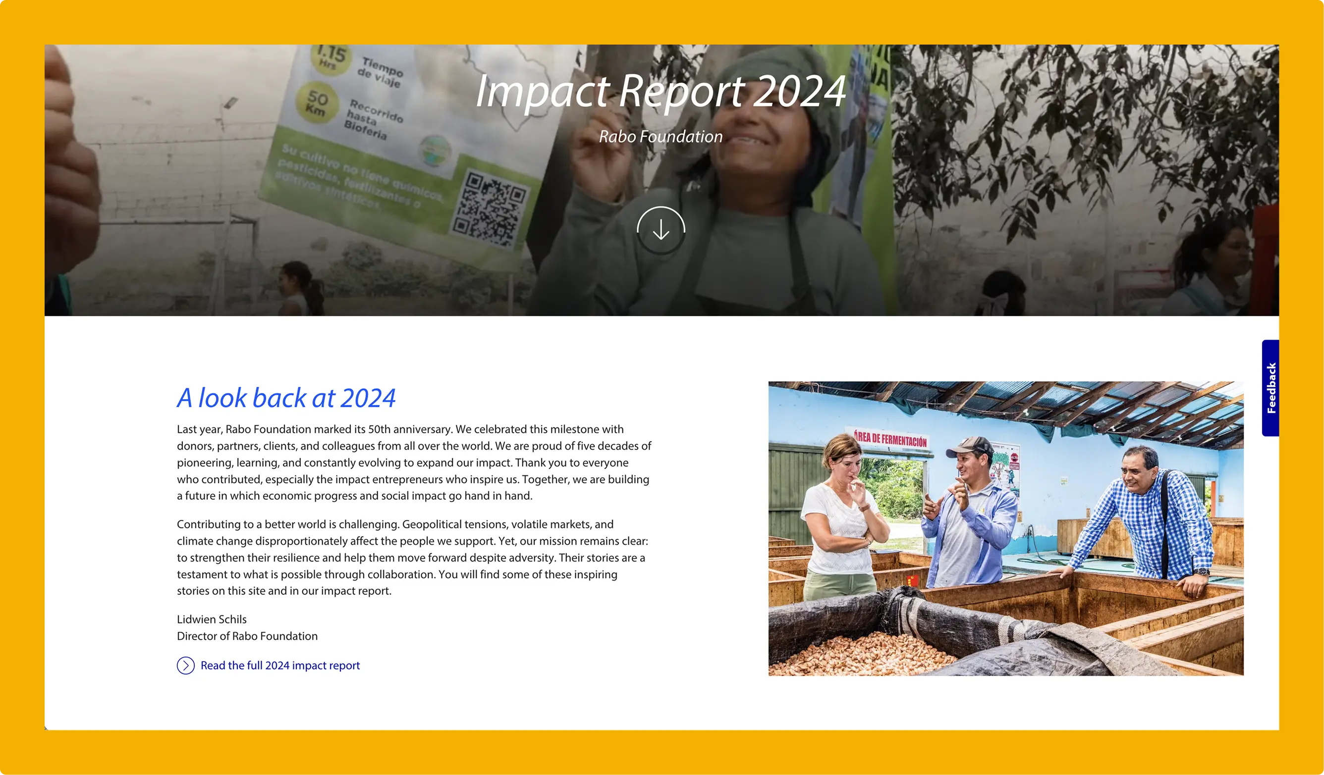
Rabo Foundation, the philanthropic arm of Rabobank, marked its 50th anniversary with a report spanning 470 projects in 22 countries. The focus: smallholder farmers in Africa, Asia, and Latin America, plus social entrepreneurs in the Netherlands.
What makes it work: Visual storytelling at scale. The report uses a clear grid layout and consistent photography style to move between global metrics (€59.8M allocated, 1.9M people reached) and individual project profiles without losing coherence. It proves you can cover 22 countries without the design feeling scattered.
3. EDCTP — Annual Report 2024
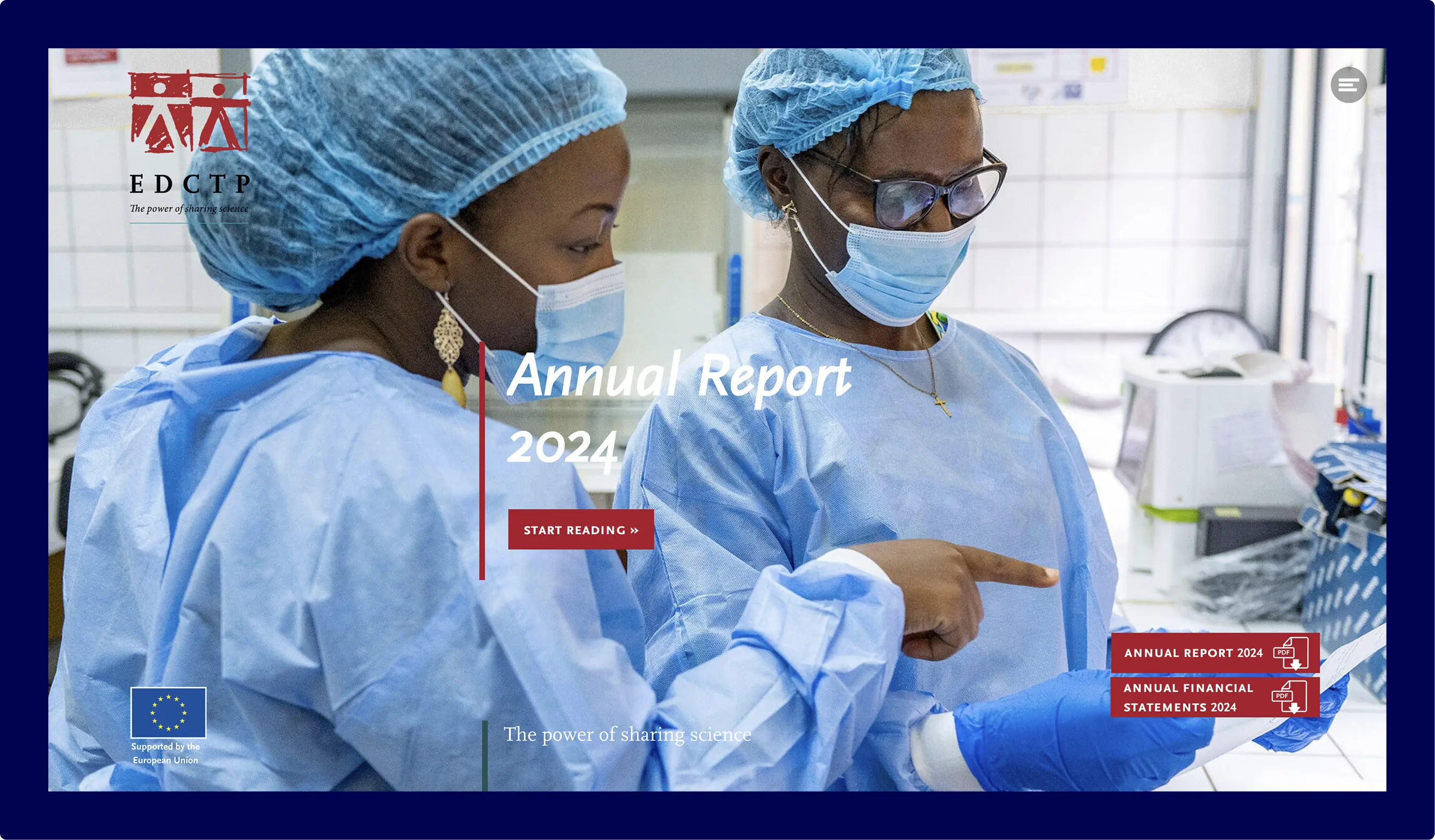
The European & Developing Countries Clinical Trials Partnership brings together 14 European and 16 African countries to fight poverty-related diseases. Their 2024 annual report showcases €1.2 billion in funding across clinical trials for malaria, TB, and HIV.
What makes it work: The scroll-based format, created with Maglr, lets readers move through dense research content at their own pace. Project spotlights use photography and clear data callouts to break up technical material, while the navigation keeps the structure visible throughout. It turns what could easily feel like an academic paper into something people actually want to explore.
Narrative-first impact reports
Some organizations lead with story, not stats. These four examples prove that honest storytelling — including the messy parts — builds more trust than polished metrics ever could.
4. Patagonia — Work in Progress Report
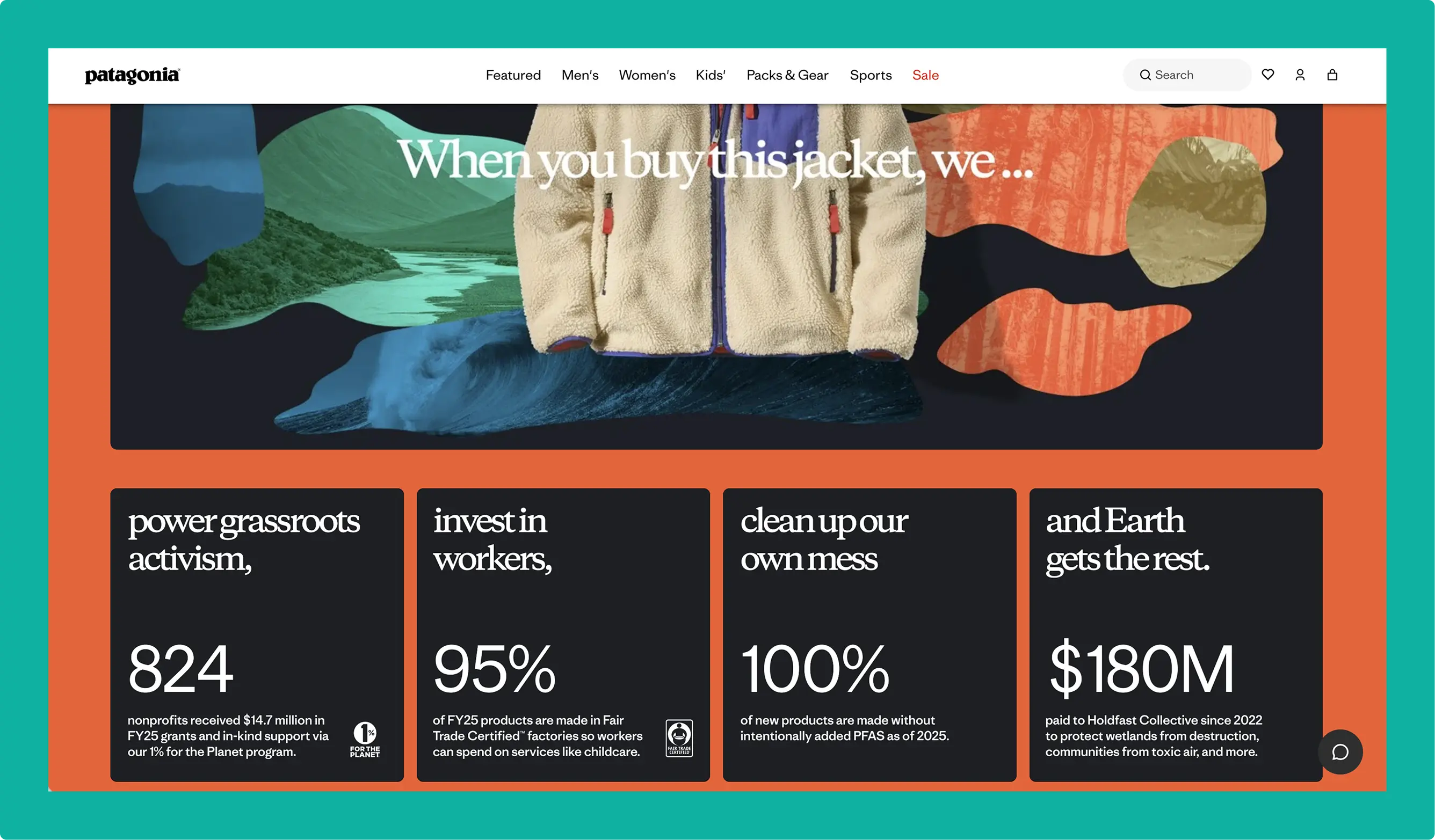
Patagonia's first-ever sustainability report doesn't open with wins. It opens with an admission: carbon neutrality wasn't working for them. The "Work in Progress" framing sets the tone for the entire report.
What makes it work: The design mirrors the messaging. Clean typography, generous whitespace, and a muted color palette signal seriousness over salesmanship. Long-scroll sections give complex topics (PFAS removal, supply chain ethics) room to breathe. It feels like reading a well-edited magazine, not a corporate document.
5. Armed Angels — Impact Report 2024
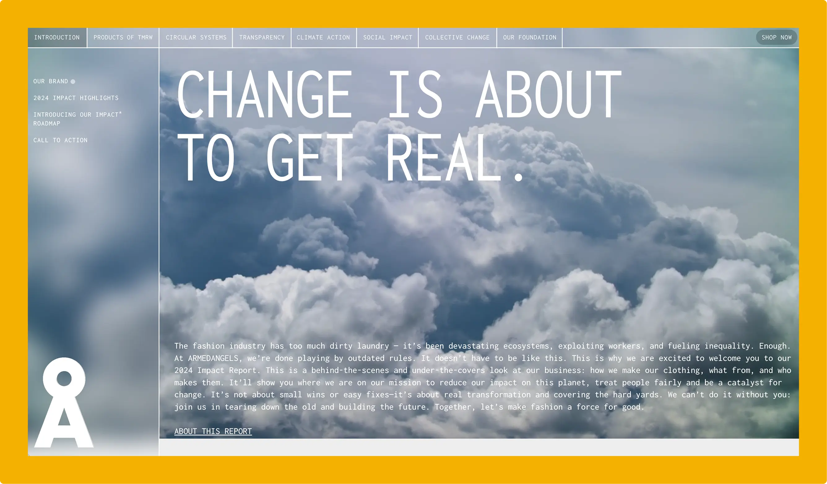
Armed Angels is a Cologne-based sustainable fashion brand known for its rebellious, direct tone. Their 2024 impact report covers supply chain transparency, material sourcing, and circularity goals — the same commitments you'd expect, but presented in a way that feels unmistakably on-brand.
What makes it work: The microsite format. Published on its own domain, the report lives as a standalone experience rather than a buried subpage. The typography, color palette, and photography match their product pages exactly, and animated transitions create energy throughout. It proves that impact reports don't have to feel like a separate obligation — they can be an extension of your brand.
6. Something Familiar — Rituals for Good
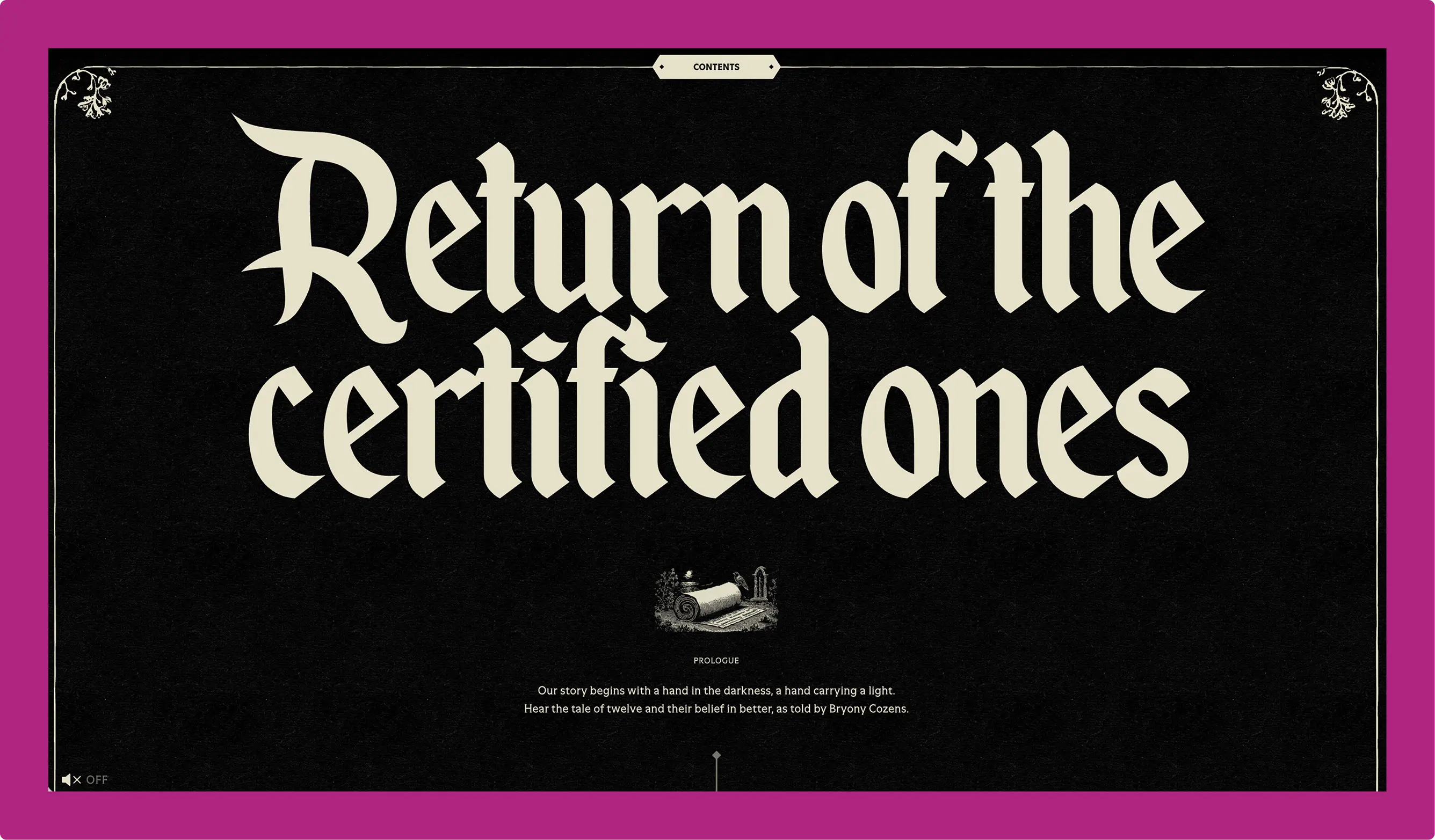
Bristol-based creative agency Something Familiar turned their B Corp report into a piece of folklore. "Rituals for Good" uses 18th-century woodcut aesthetics, medieval marginalia, and a narrative structure about transformation and belief.
What makes it work: Total commitment to a creative concept. From the moment you land on the page, you're entering an experience — not reading a document. The illustrations, typography, and navigation all reinforce the folklore theme, and the pacing feels almost theatrical. It's one of the most distinctive impact reports we've seen, and a reminder that taking creative risks can generate attention a conventional format never would.
7. Campfire Consulting — 2023 Impact Report
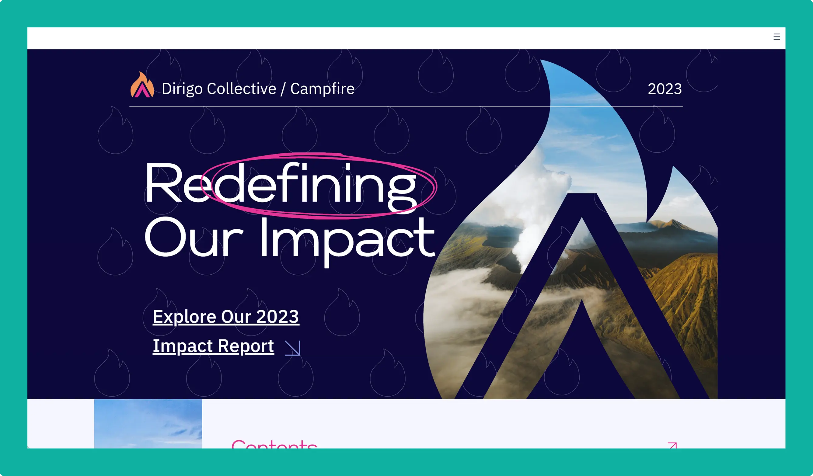
Campfire Consulting is a B Corp media agency that helps purpose-driven brands tell their stories. Their own impact report practices what they preach: clear narrative structure, strong visuals, and a focus on the "why" behind their work.
What makes it work: Tight visual hierarchy. Each section leads with a bold statement, supported by data visualizations that don't overwhelm. The pacing feels intentional — you're guided through the story rather than left to dig through pages. It's a good example of restraint: not everything needs to animate.
Data-driven impact reports
Not every organization leads with narrative — some have metrics that need to take center stage. These two examples show how to present complex data in a way that's readable without being overwhelming. (For more on this approach, see our guide to data storytelling.)
8. Port of Rotterdam — Digital Report 2025
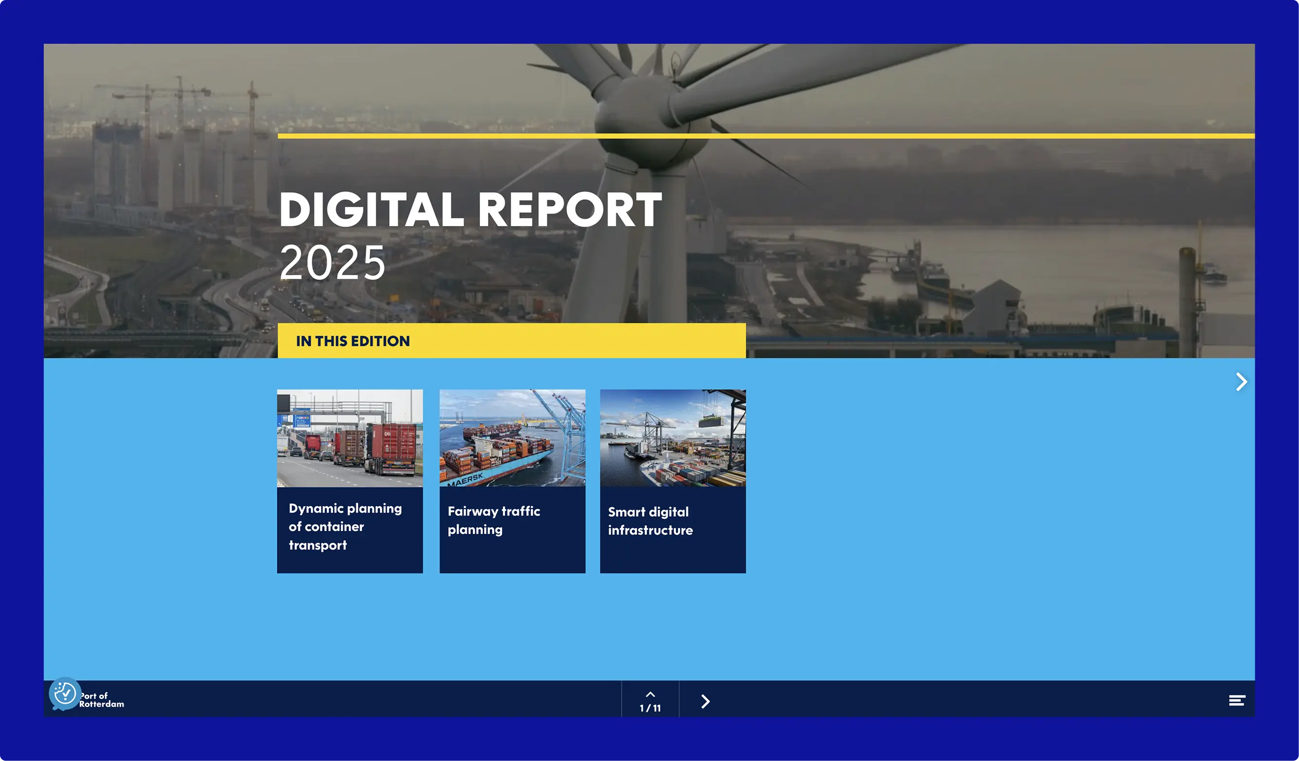
Europe's largest port doesn't do small. The Port of Rotterdam's 2025 annual report covers smart infrastructure, container logistics, and energy transition — topics that demand serious data.
What makes it work: Layered information design. The report gives skimmers the headlines and lets analysts dig deeper, all within the same experience. Interactive elements let readers explore at their own pace, and clear visual hierarchy ensures that dense content never feels overwhelming. It's a strong example of making technical reporting accessible to mixed audiences.
9. Hamilton Lane — 2025 Annual Impact Report
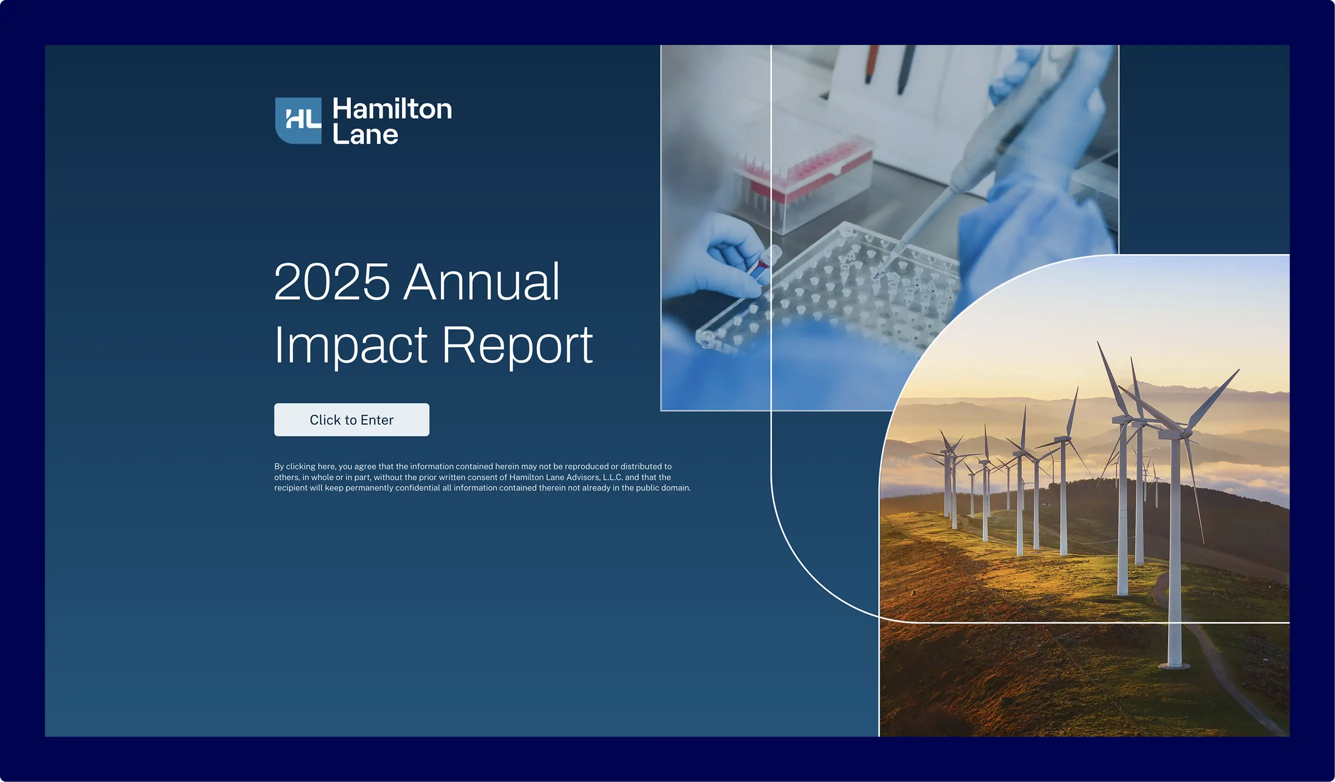
Hamilton Lane is a private markets investment firm with nearly $1 trillion under management. Their 2025 impact report tracks the social and environmental outcomes of their impact investment funds.
What makes it work: The scroll-based format and data visualizations, built with Maglr, guide readers through methodology, portfolio highlights, and outcome metrics in a logical flow. Complex financial information is broken into digestible sections with clear visual hierarchy. It's proof that even institutional reporting can feel modern and readable when the design does the heavy lifting.
What these examples teach us
Let people explore, not just read. The strongest reports use interactive elements that let readers move at their own pace. Hover states, scroll-triggered reveals, and layered information turn passive reading into active exploration.
Photography adds character. Numbers land harder when you've seen faces first. Strong photography grounds statistics in real people and places — and makes reports feel human rather than clinical.
Brand consistency builds trust. Impact reports can extend your visual identity rather than interrupt it. If your report looks like a different organization made it, you're missing an opportunity.
Format is a design choice. A microsite, a scroll-based experience, a highly stylized concept — the container matters as much as the content. Interactive formats hold attention longer and signal that you take your own story seriously.
Start building
Ready to create an impact report that people actually want to read? Browse more examples in our inspiration gallery or request a demo to see how Maglr can help you build interactive impact reports, sustainability reports, and annual reports without code.