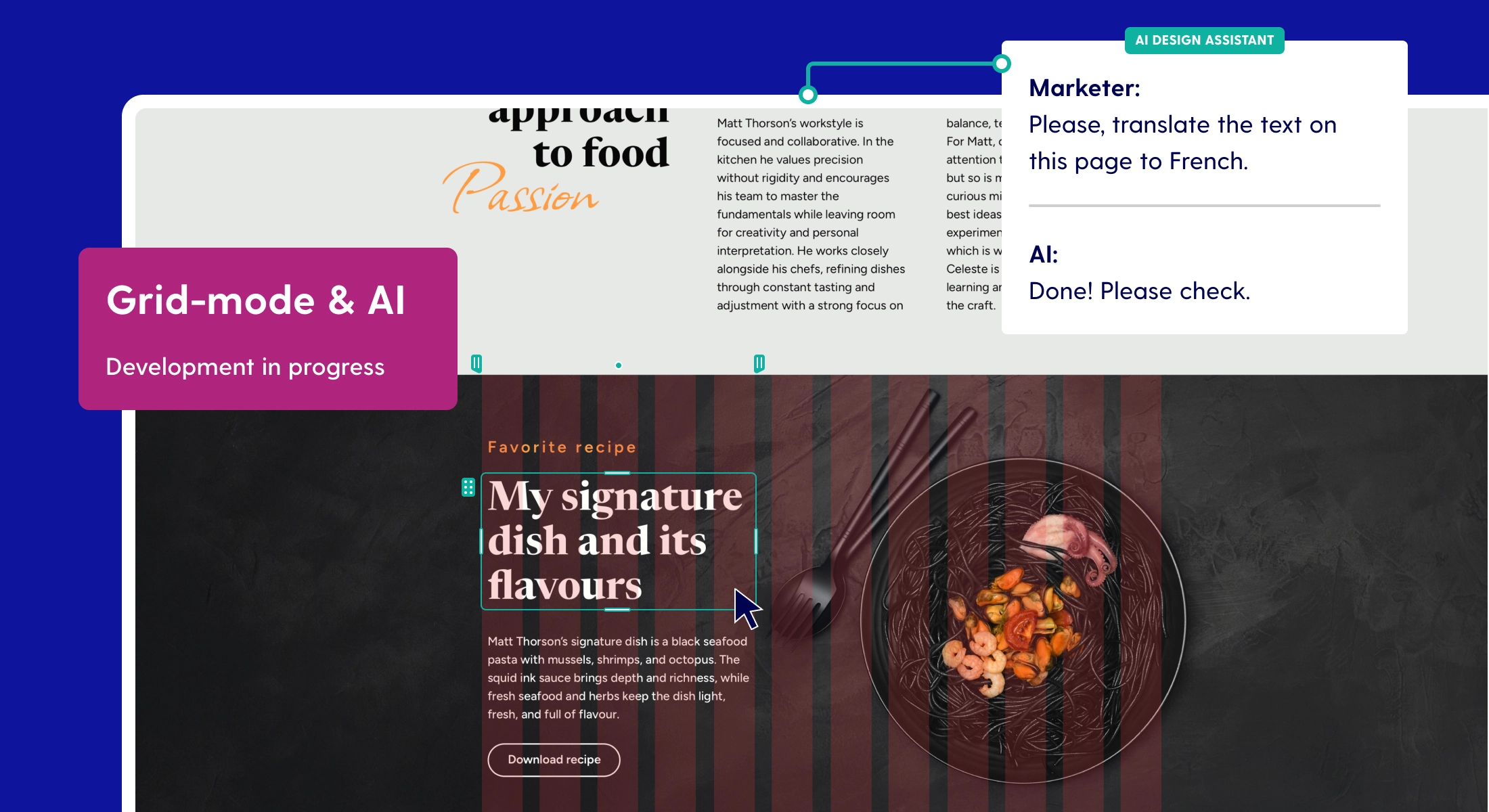
New element positioning in Maglr Pro
With the addition of more and more options, the positioning of elements within the editor became a bit unclear. So it was time for an update. In this blog we will give you an overview with all of the new Pro functionalities.
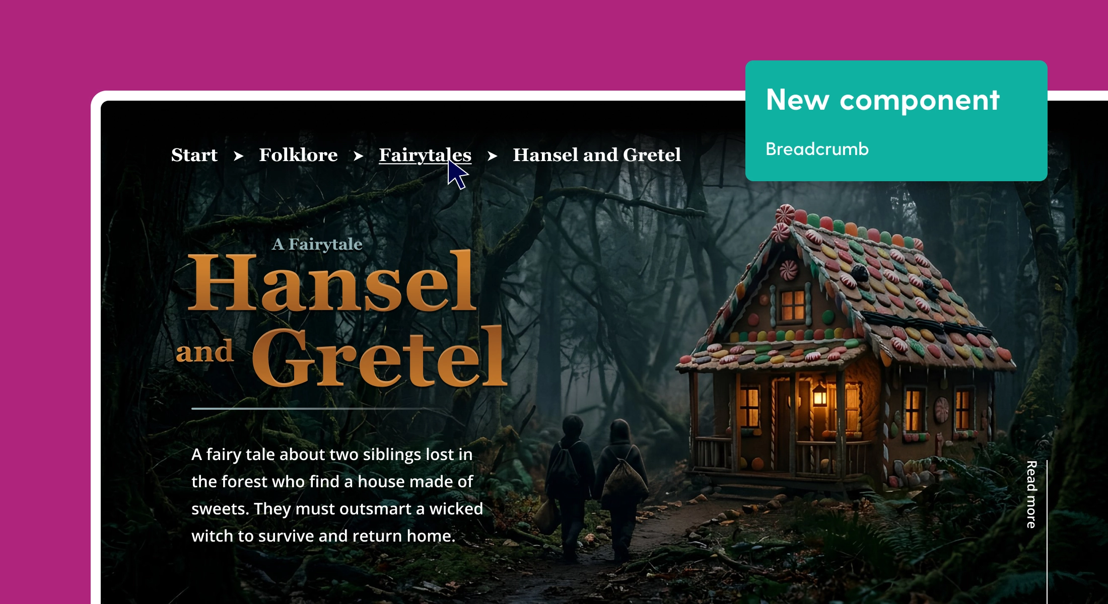
Positioning elements simplified
The option to align elements on a margin was rather hidden in the current version. We have revised the side panel and combined all positioning options in one overview.

By default you position an element based on the 'safe zone', this remains unchanged. When you choose a 'margin' you can now clearly see to which corner the element is attached with our added indication line. And as the page gets wider, the element always remains at the same distance from this corner. You cannot see this directly in the editor, but can see it live in preview mode by changing the dimension of the preview screen.

Furthermore, it's now easier to adjust an element to fullscreen or full width. This preset can only be used on individual elements, not for groups. Depending on the positioning types we have added different colors to the selection borders for a better recognition.
Now also position as 'Sticky' element
Position 'Sticky' has been moved from the scroll animations to the alignment options. This function can only be used on longpages (or the mobile view), because the page must be able to scroll. With 'Sticky' you stick an element or group to a fixed position on your page, even when the page is scrolling.

With this new development it is now possible to combine a sticky element with a margin position. You can leave a sticky group in the middle of your page, but you can also place a menu bar at the bottom of the page. The editor immediately shows how the sticky position works. During the movement of the workspace you will see the element stay in place.
Simply make the worksheet larger
It's no longer necessary to make a 'longpage' or 'mobile page' longer through the settings panel if you need more space. You now pull down the workspace with a handle to extend the height of the page.

Create whitespace between elements in a longread
Example: you have created a 'longpage' but are getting new corrections; an extra chapter must be added halfway through the page. This would previously mean that you had to select all elements and move them manually. You probably also had to zoom in and out a few times to get everything in view. This could be done a lot easier.
With this update you will now see two arrows after selecting an element in the left margin border. With these arrows you can now drag all content, below the line, down or up. This way you can easily add new content in the appeared whitespace. And is the worktop too small? The editor automatically enlarges it.
A simple but handy addition to current animations
With all the extensive animation options, we actually missed some simple variants to attract attention.

We have now added 'Move' and 'Rock' to the current animations. A simple movement where you can adjust the direction and strength. These two variants are effective for subtly giving elements in your design a little more attention.
Use multiple hover actions for custom buttons
By updating the hover effects in the editor it is now possible to create more fun and animated buttons yourself.

First you create a group with multiple elements as in the example above. Then you assign a hover effect (or more) to each element, place a link on the group itself and the complete group now triggers the underlying hover effects on the elements.
All your colors centralised with the new color panel

Colors were previously saved per page. When working with multiple pages, this wasn't very useful. Therefore we have aligned this throughout the entire system. With the new color swatches you have two groups of colors at your disposal:
- System colors : Available throughout the system
- Document colors : Only available for the publication in which you work
New addition scene settings: Direct scene transition
With the transition of a scene you now also have the option 'Direct'. This option actually means there is 'no' scene transition or transition between changing the scenes. We have added this option because more and more simple quiz pages are being built with the editor. With this transition you now switch directly from question to answer or vice versa.
Turn off the scene snap
Have you made a neutral scroll page from multiple scenes? Then you might recognize the magnetic snap in it. This snap is designed to immediately show a slide. As soon as the scene is displayed, the animations start while everything remains on screen.
Now that pages are increasingly being used for longreads, this snap is not always logical. If you switch off the 'snap', the behavior of the animations changes. The system now doesn't wait until the page is completely on screen, but the animations start to run when the page is loaded at 50%. Disabling the snap works best in combination with scroll animations (based on viewport position).
Improved text editor

We offer two types of text elements. The 'Title' and 'Richtext' element. You can style a 'Richtext' element in two ways:
- Select element and change colors or font in its entirety
- Make selections with a double click and assign multiple colors and styles within a single element.
This last piece in particular has been improved and made clear what is or is not possible via the settings. Please note: when you adjust 'Richtext' with multiple colors and styles, all colors will be reset as soon as you adjust the base. Here we have followed Sketch's methods.
What has been adapted for mobile?
When preparing the mobile version, we deliberately chose to do this manually. Due to the complexity of desktop pages, we cannot automatically determine positions of elements. With the innovations we have made it much easier.
Size of elements are automatically adjusted
Elements that you drag from the library into the page are now automatically adjusted in proportion (width and height). We do this for images but also for text frames. This way you can use an element directly and save time resizing and positioning.
Drop groups onto your mobile workspace
The same now also applies to groups. If a group fits within the mobile ratio, the group is taken over 1 on 1. If a group is larger than normal, then we adjust the dimensions and position on the mobile worksheet. A manual correction is still necessary, but here again it saves a bit of click and selection work.
Sticky position on mobile
The new 'Sticky' option can now also be used directly on mobile. With this new option you can create:
- A sticky menu with internal vertical scroll links to chapters
- Share buttons that remain on screen
- A small pop-up window that sticks to the center of the page
Please note that scrolling within a group is not possible! Sticky elements that fall outside of a mobile screen are therefore not visible.
Sticky scenes now also available for mobile
Does your mobile page consist of multiple scenes? Just like with desktop, make the first scene transparent and place it with the 'pinpoint' icon in the scene panel on 'sticky'. At that moment the scene will be placed on top of the other scenes.

In the example above, the menu icon together with the drop-down menu is placed in the above sticky scene. The scene has a transparent background so you can see through it while scrolling.
Questions?
Do you have questions about this update? Let us know via the chat in the dashboard or call +31 76 543 08 52.
Do you also want to stay informed or our updates and news? Then sign up for our newsletter!