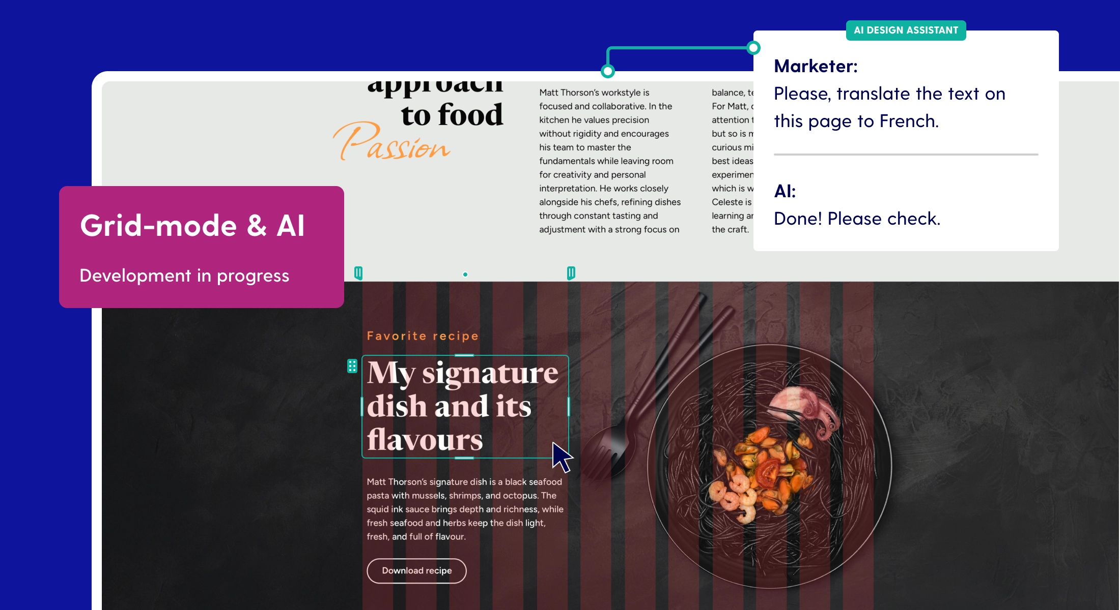
"Zoom" option available for longpages
Are you team "original fit" or team "zoom" for Pro publications? For the second group, we have good news. A "zoom" option has been made available for longpages in Pro.
Back to the basics: page scaling behavior
Just a little refresher regarding page scaling behavior in Maglr.
Maglr Pro offers two types of behavior for scaling pages.
- Original fit (previously "adapt to screen"): The "original fit" option sets the page to a fixed size. That means the space of (and between) element is also fixed. When the browser window gets bigger, the size of your page remains the same. The additional space is filled with your set background colour. As the window gets smaller, the page also scales down to display all content inside the safe zone.
- Zoom (previously "scale to fit"): A "zoom" page scales elements in proportion to the viewer's screen size. Additional space will be filled with the default background colour. What you will notice is that all elements grow bigger or smaller as the canvas is resized. This is a good option if you have a design where it is essential for elements to remain proportional to each other, but don't want them to grow larger than you have designed.
The difference may not be evident immediately, but becomes clear when viewing your design side by side on various screen sizes. Reality is that many people work on an external monitor which might display your publication very differently from what you had intended.
The descriptions above can be found in our help docs about page types & behavior.
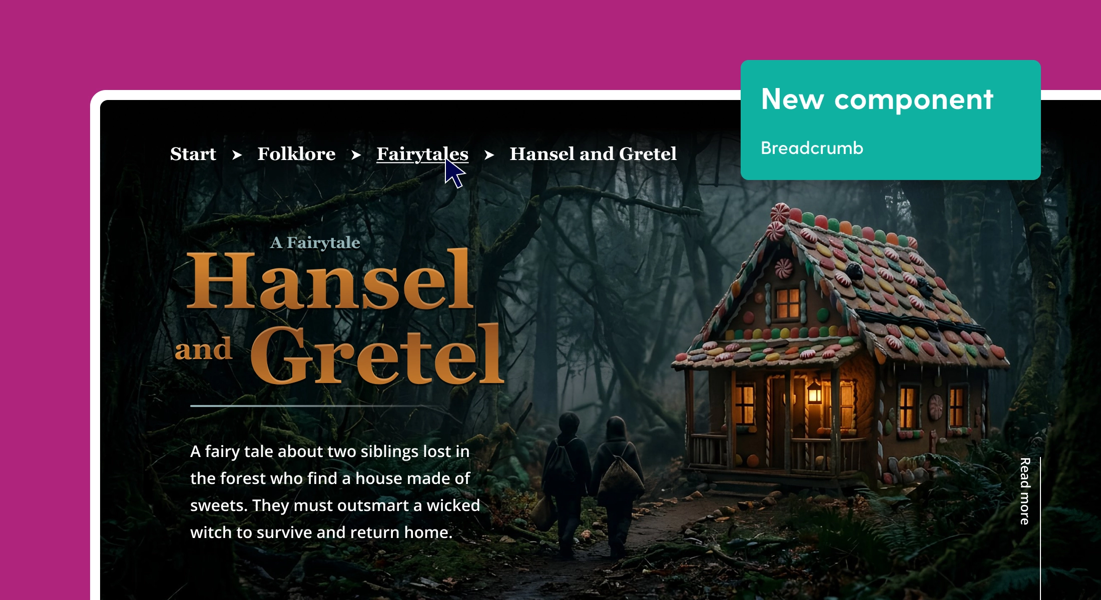
"Zoom" option for longpages
Where the "zoom" option (or previously "scale to fit") used to be available only or fullscreen pages, it is now available for longpages as well. Elements grow and shrink depending on (only) the width of your canvas instead of height too (as is the case with fullscreen pages). Take a look at the differences between the current "original fit" behavior and the new "zoom" option in the longpage demonstrations below.
Original fit
The "original fit" page scaling behavior is how longpages behaved by default as it was the only option available. You can see how elements stay contained within the maximum container width and white space is added on the sides. In this screen recording, we are scaling from 1440px (laptop) to 2560px (4K).
Zoom
With the zoom option, you can see that elements gradually grow as the width increases, preventing white space on the sides to occur. Changing the height of your browser window will not affect the design as we're dealing with a scrollable page.
There's pros and cons to this setting.
Pros:
- You'll be able to design longpages in a 'what-you-see-is-what-you-get' (wysiwyg) fashion, meaning your finalised design looks the way it does in the editor, regardless of screen size
- As the screen grows wider or shrinks, your elements become larger or smaller
- No excessive whitespace on the sides of your publication
Cons:
- In some rare occasions, fonts may become very large, decreasing readability
- It's not recommended to use both "zoom" and "original fit" on different scenes within the same page, as this may lead to undesirable results and disturbance of design harmony.
Changing your scene's scaling behavior
Naturally, you will pick either "original fit" or "zoom" upon creating a new Pro page. But what if you decide you'd like to change your scene's scaling behavior? Simply navigate to the scene you want to change. Go into the 'General' tab and find the newly added drop down under 'Scene type'. Here you can change your scene scaling behavior. Be sure to check the differences within preview mode!

Which one is right for my design?
Which option is suitable for your idea depends on your situation. If you have a page with lots of text content, the safest choice would be to go for "original fit" as your content will remain within a maximum width which retains readability of your document. If your page is highly visual, like the timeline in the example, your design might be viewed best with the "zoom" option.