Transitioning to CSS Grid (”CSS.. what?”)
Several months ago, we shared a roadmap update with some of the upcoming features. Here, we mentioned an update to our layout engine, also known as “CSS Grid”, for Pro publications. As we draw closer to its release, we wanted to tell you more about why we have decided to make the switch and how this engine works “under the hood”.
The current problem
The Pro editor allows designers to position elements freely on the canvas. Everything that is put on the canvas gets rendered into a valid web document - exactly as you have designed it. The aim of the Maglr platform is that you can design freely, without code, and trust the output looks identical.
The reality is, that we do not always have full control over how designs are rendered in various cases. For example, text properties can behave differently depending on the device and browser. That goes for font size, weight and line height amongst others. This can create situations in which text overlaps and becomes unreadable, for instance when content becomes longer or font size is increased. Moreover, web pages should be scalable for those with accessibility settings turned on. According to accessibility standards, a user should be able to scale the page by 200% with the page remaining readable and balanced. This is often not the case.
Why we are switching
In a nutshell, there are several motives for switching to a new layout engine:
Issues with overlapping elements: In the current behaviour of our editor, there is no relation between elements. Everything is freely positioned and not “content aware”. That means that elements can overlap or run into each other (not just text). What may look good on one screen, could look off on another.
Better scalability on various screen sizes: In the same vein, designs may not turn out as they should on various screen sizes. The grid engine ensures better responsiveness regardless of the device.
In preparation for upcoming features: Some of the upcoming features mentioned in the roadmap update could not have been built on the current layout engine. Hence, it only made sense to transition now as a necessary preparative step.
What is CSS Grid? (”explain like I’m five”-style)
To explain to you what CSS Grid is, we’re going to keep it simple with an analogy.
Imagine you have a piece of paper and you want to draw a grid on it, like when you're playing tic-tac-toe. You have rows (lines going across) and columns (lines going up and down). When you put these lines together, you get little boxes where you can put things inside, like a chessboard.
CSS Grid is like that for websites and online publications! It helps you organize a webpage by making rows and columns, and then you can put elements such as text, images or buttons into the boxes, so everything is nice and neatly organised.
The only difference here is that you are not doing this manually in the Pro editor - rather we are doing it for you upon publishing.
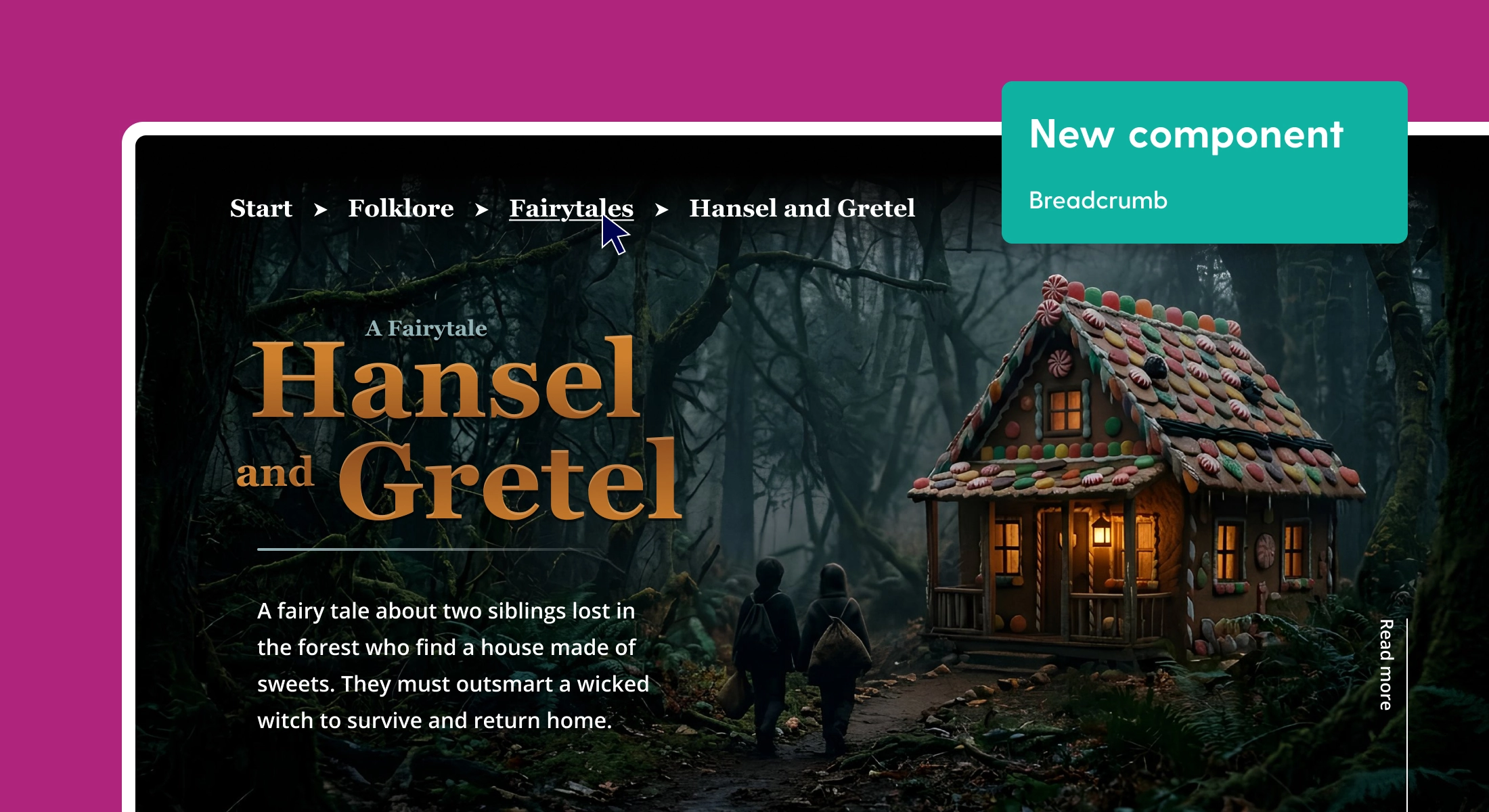
If you were to inspect the grid of your publication in your browser, it would look something like this. See how elements align along rows and columns?

What you will notice
What better way than to show you immediately. We’ve recorded the before and after situation with one of our templates.
The current situation
Here’s a recording of a window being resized. See that stutter and how it seems laggy? That’s because it is. Every time the window is resized, a calculation is made in the background in order to resize the canvas and its elements. Not ideal.
The new situation - leveraging the power of ✨ CSS Grid ✨
Here’s what it looks like after embracing the native power of the browser with CSS. Huuuge difference right? And better for performance too, because no expensive calculations are made. We’re purely leveraging the power of the browser engine itself. 💪
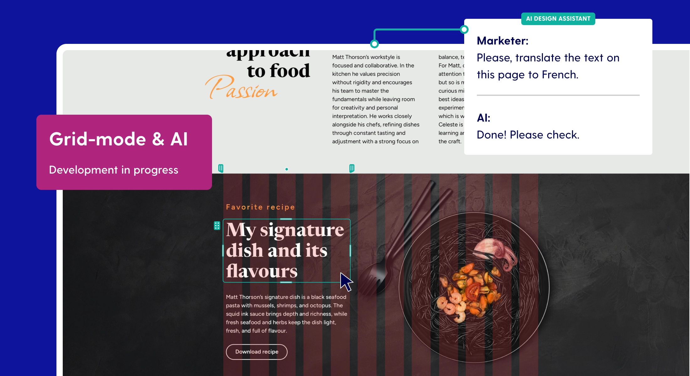
In addition to better scalability, the new grid engine also tackles issues with overlapping elements. As your components grow or shrink, they can push away other elements to create more space. Here’s what that looks like:
While the difference may not be evident immediately without this demonstration a lot has changed “under the hood” to make this possible. If find you have fewer issues with your designs on various screens—that is most likely thanks to CSS Grid. Publications will scale better (responsiveness) and elements have some contextual awareness in that they can grow while pushing other elements away to create more room.
We are currently in the final phase of testing internally to find bugs before they find you. Release is currently planned for the upcoming week. Once released, your projects will be converted to the new grid engine upon (re)publishing. While it’s not a necessity, it’s definitely recommended if you’d like your online publications to scale smoothly!
Bonus: Why we don’t work with rows (flexbox) like others
We’re aware that other design software platforms work with manually dragging rows and columns onto the canvas - thereby deciding the grid structure yourself and creating relational awareness between elements.
This system works, and would technically be easier to implement, but goes against the vision that we have with Maglr. We vouch for creative freedom, and that includes the ability to position elements freely.
It is this feature that allows our clients to create highly stylised, innovative and modern layouts for magazines, brochures and other digital publications without restriction or the need to adhere to a certain framework. Therefore, free positioning is a core value of our platform.