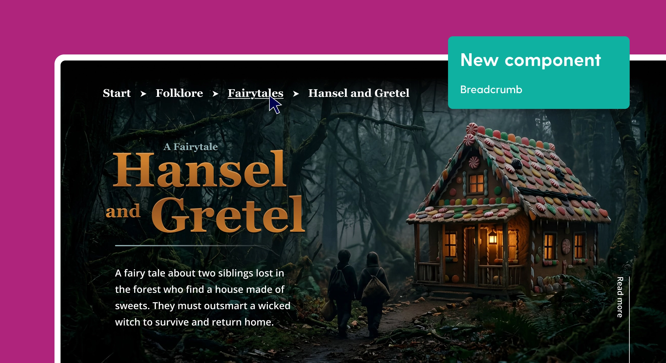
Now available: Tables in Maglr Pro
Starting today, it’s possible to create tables directly in our Pro editor. These can be fully styled and customised, complete with animations and effects. You can also convert them into dedicated mobile versions to optimise their performance and usability on smaller devices.
What’s new?
Previously, you had to manually build your table using separate elements, or create it with another tool and place it as an image in Maglr. The main struggle here was that these tables were in no way interactive or accessible, but they also cause a lot of issues when you’re trying to convert them into a mobile version.
With our new Table element, all of these struggles are now history.
Extensive customisation options
You can now create and customise tables that match your own branding, using our Maglr Pro editor.
Custom column, row & cell styles
Every single cell in your table can be completely customised to your liking. From background colours & border styles to the font style and its alignment. You can also create different styles for entire rows and columns (first, last, odd, and even) to further style your table.

Sticky headers
Both the first column and row can be turned into ‘headers’, meaning that these will also receive distinct styles to set them apart from others.
And if you have created a table with a lot of data, you can make its header ‘sticky’ to keep it visible at all times. The header will then remain fixed to the screen (horizontally or vertically) while scrolling through the rows and/or columns of the table. This feature works when the entire table is placed on the page itself, or when you make the table scroll within a smaller frame.

Table size & column width
When adding a new table to your canvas, the width of your columns is set to ‘auto’ by default. This makes your table fit perfectly inside the frame you have drawn. The content inside your table automatically determines the width of each column.
By hovering over the column dividers, you can manually drag to change the width of each column separately. From that point onwards, your table maintains the same ratio. This ratio is also applied on mobile by default, but you can manually overwrite this ratio when editing the mobile version of your table.
If you add multiple rows to a table, the height of the rows determines the final height of the table. By adding padding to the cells, you can create more white space between the rows. If you want to make the content of a table fit the size of the selection frame, select the "Stretch table" option in the element settings panel.
All customisation options can be found over at help.maglr.com
Handling the mobile version
The biggest issue with tables is creating one that works well on different types of screens. In order to tackle this issue, we have given you complete creative freedom in both the design and technical setup of your table.
As with all other elements in Maglr Pro, the table you create on desktop keeps its contents, settings & ratio when you place it on the mobile canvas. However, you can then completely customise this version without altering its desktop equivalent. This allows you to apply different column widths, or to enable horizontal (or vertical) scrolling, exclusively on the mobile version. You can also completely override the styling and typography of your mobile table to ensure that it works well on smaller devices.
Accessibility
If you manually created a table using an image, you could only add a description to the image to tell your visitors about the contents of the table. Now, your entire table has become accessible to search engines and screen reading software.
People using screen readers can have the row and column headers read aloud as they navigate through the table. Screen readers speak one cell at a time and reference the associated header cells, so the reader doesn’t lose context.
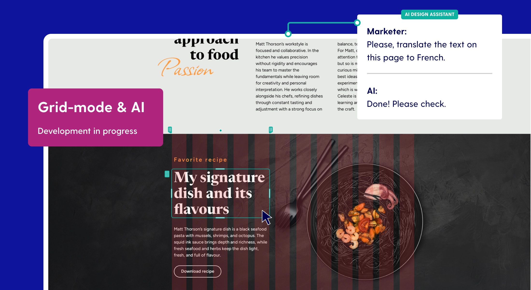
What’s coming?
Interactive components
We are developing various small interactive components that can be easily added to your designs. These will include counters, gauges, share buttons, scroll indicators, and social elements. These are pre-programmed snippets that you can incorporate into your own designs using custom styling.
All upcoming features can be found in our roadmap.
Changelog
To stay updated on developments within our platform, we have made a public changelog. While we communicate major updates through email or dashboard notifications, we do not always report on smaller changes.
We recently began tracking all significant changes in the dashboard. These may include bug fixes that are important to know about, as well as minor changes and new features.